NVIVO
A Free Trial Failing to Convert
NVivo is the developer of a suite of qualitative data analysis software products. Its core product, NVivo, is a popular tool for researchers to manage and analyze their data. NVivo had a barebones 14-day Free Trial experience that was ineffective. The team was struggling to attract users to sign up for the Free Trial in the first place, much less to convert them into paid customers. The user experience was confusing and it took almost 20 steps for users to complete the full Free Trial experience. There had been too many cooks in the kitchen. Over time, the entire Free Trial had become bloated with too much information resulting from a lack of focus.
A Complete Overhaul to Improve Conversion Rates
The NVivo team admitted they didn't have a clear internal understanding of the Free Trial structure and its purpose. Most of the people who created it were no longer on the team and they had added things ad hoc over time without a clear strategy. If they wanted to see improved Free Trial metrics for NVivo, they were going to need a major overhaul.
That's when NVivo came to Drawbackwards looking for a more thoughtful and comprehensive approach. They wanted to create a seamless Free Trial experience that felt like an accurate reflection of the core strengths of the product. With very little institutional memory of the past, they needed to define the future.
Stopping the Bleeding with Quick Design Fixes
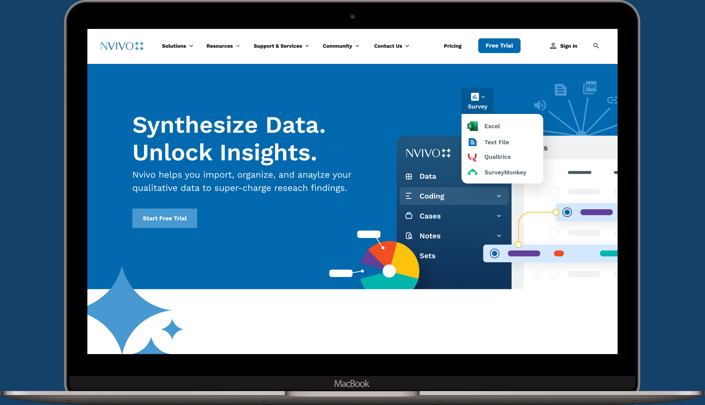
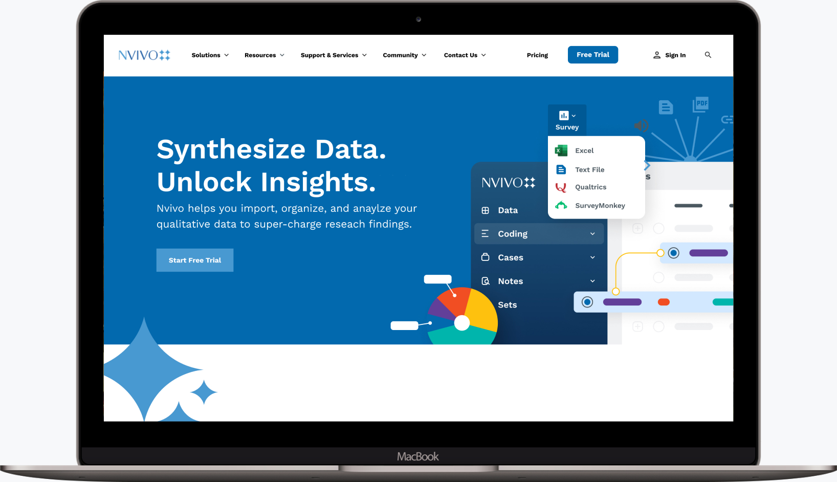
Our first step was to address the obvious problems with the marketing site. It wasn't doing an effective job of pulling users into the Free Trial experience. The main call-to-action (CTA) buttons were confusing and competed with each other, and it didn't effectively communicate what users could expect to get out of the product.
Our designers pounced on it and quickly delivered a streamlined modernized design. We made it clear why users needed to try the product, and guided them through the steps to create an account and sign up. As the tip of the spear, the marketing site was a crucial first step in the experience and set the tone for everything to follow. We knew that a better design would show immediate results and help stop the bleeding of users bouncing before signing up for the Free Trial.
Setting a New Foundation with UX Journey Maps
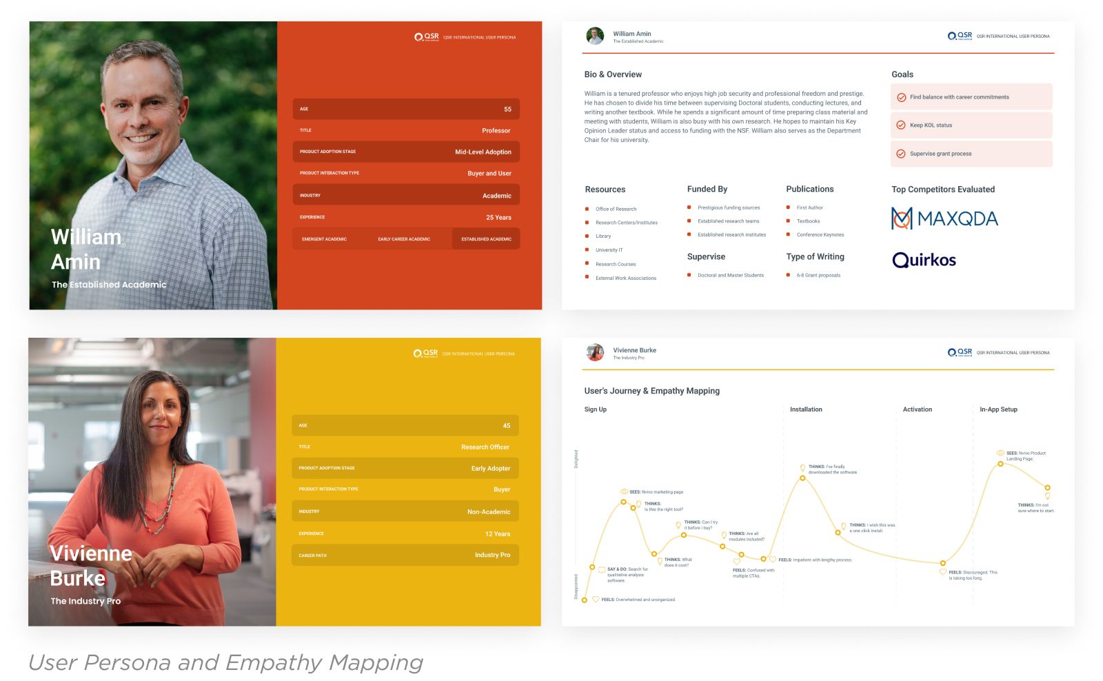
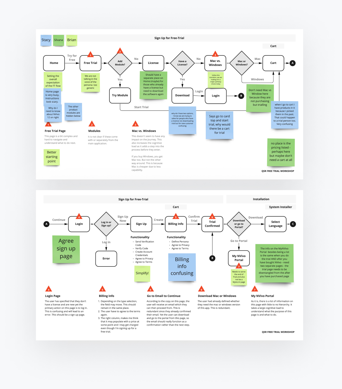
Visual design is only as good as the structure it’s built upon. For a longer term fix, we needed to dig deeper into the existing user flow because you can't fix something until you know how and why it's broken. An accurate map of the entire Free Trial user journey would help guide our attention to the areas that required the most attention.
A journey map helps the whole team have more productive conversations by providing a model of the big picture. You can refer to it when discussing the nuances of how business requirements compete with user needs. You can see where users enter and drop out of the flow. You can more easily point to areas of current pain and visualize opportunities for future potential.
The map gave our combined Drawbackwards and NVivo teams the ability to see where the flow doubled back on itself. It helped us identify gaps where we weren't providing enough context or information. It showed us where we could more actively guide users through the Free Trial experience by sending them timely reminders and updates.
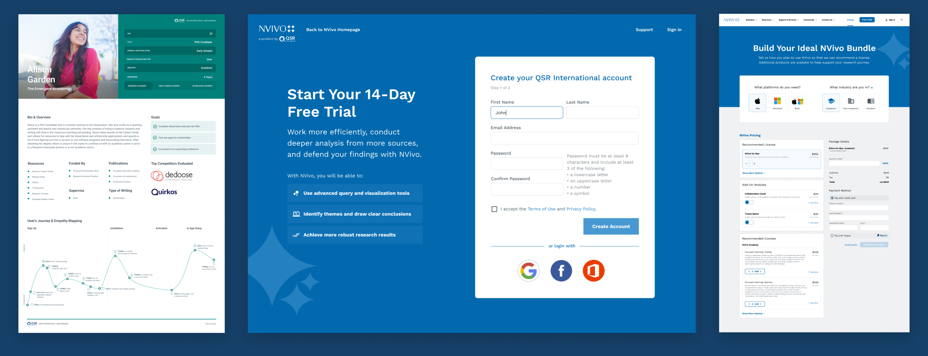
For example, we discovered through the mapping process that many users were getting lost at a critical early stage. They needed to "activate" the Free Trial after downloading and installing the product. Most users were not aware of this and never initiated the Free Trial because of that. By seeing how this critical step in the process was creating an obstacle for users, we could quickly identify new ways to help them through it.
You can't dump users into a flow and wish for the best. To cultivate users through a Free Trial, you need to guide them through clearly defined stages and simplify each step as much as possible. It's certainly inefficient, and almost impossible, to do that well without a clear understanding of the entire user journey


Identifying a “Happy Path” for Long-Term Impact
A Free Trial experience is a living and breathing thing that should evolve alongside your product. You can’t create it once and forget about it. That said, you can create some stability and consistency by setting a solid structure based on clear long-term goals. Most of the NVivo team was new and approaching the NVivo Free Trial experience with fresh eyes like we were. That gave us the opportunity to view the entire flow without too much concern for cutting out pet projects or features. We could think through the problem from a common point of reference without too much pushback on new ideas.
On the flip side, there wasn't a lot of perspective on why things were the way they were. We couldn't know if we were unwittingly about to step into known traps. What we could do, though, was to focus on the long-term user goals and needs we were confident wouldn't change. We used our journey map to define a "happy path" that users would ideally take through the flow. We could focus on what the user needs at each point in the flow and talk through ways to speak to that need in the best way possible.
The ultimate goal of a Free Trial never changes. You want users to try your product, feel the benefits it can deliver, and decide to buy. If you can keep your focus on that goal, every other choice becomes a little more clear because it's there to support that one goal.
Communicating Benefits Over Features
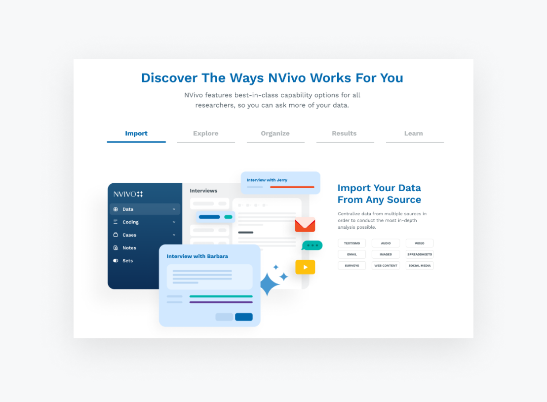
Many Free Trial experiences put a heavy emphasis on showing off features of the product. But the best features exist to deliver value, and value creates a perceived benefit. Users are evaluating your product not based on what the features do but on what the features help them feel. They want to know if your product will solve a problem for them, or make it easier, faster, more efficient or even delightful for them to do their work.
QSR had fallen into the trap of talking primarily about features. We helped them refine their messaging on the marketing site and throughout the Free Trial follow-up emails to focus on benefits. We also created new visuals to help show off the product. Our Drawbackwards team created custom illustrations that conveyed key concepts. We showed not only what NVivo does and how good it looks, but the time-saving benefits that it delivers to its core users.
Targeted Emails to Create a Guided Experience
As soon as they download a Free Trial version of a product, users need help understanding how to start interacting with it. They need to quickly see how it can help solve their core needs and challenges. They need to feel comfortable exploring on their own with the feeling that you're there to help if they get stuck.
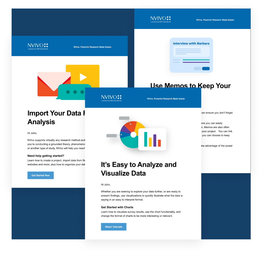
NVivo follow-up emails weren't moving users through the Free Trial flow and pulling them back into the product to explore more after sign-up. We used our journey maps to determine when users needed to know certain things. We reviewed email designs to ensure branding consistency. We also helped iron out business decisions as granular as determining whether the emails should come from NVivo (the parent company) or NVivo (the product).
These decisions are often made in silos, with the marketing and product teams independently making dozens of small decisions. By bringing these teams together through the user journey maps, we can make sure our decisions don't lead to a disjointed user experience. We can keep our focus on delivering users what they need when they need it. And we can increase the likelihood they'll get further through the Free Trial flow without dropping out.
Inserting Helpful Resources to Show Off Customer Support
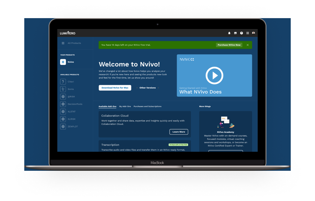
NVivo has a robust knowledge library where users can learn from each other how to get the most out of NVivo. We wanted to maximize this resource to not only help users get better acquainted with the product, but to show off the level of support they could expect if they became customers. Again referring to the user journey map, we could find key places and steps in the process where we could call out educational resources in emails or provide guides and tools within the Free Trial product itself.
Education also includes helping users the steps they need to take to buy the product and how much it will cost. NVivo's pricing page was very confusing and convoluted, with multiple versions for both Mac and PC and a variety of add-ons. We made the pricing structure much easier to understand and the buying process clearer for users to navigate when they were ready.
8x Growth in Free Trial Users and 40% Increase in Sales
When we first started working with NVivo, about 2% of site visitors were signing up and following through with Free Trials. After just some basic improvements, NVivo saw an increase to 16% of users completing the Free Trial flow. Even better, with the changes we made to the pricing page and purchasing process, QSR also saw a 40% increase in sales resulting from the Free Trial. The thought that our combined teams put into the user journey and the refinements to the design had an immediate impact on business results.
This is all even before other planned improvements that we’re working with the team to install in the core product itself. It just goes to show that focusing on the core structure of the experience and sticking to the fundamentals can have major business results. Sometimes the most important changes are the most obvious and easiest to address. If you have a solid sense of your long-term goals and build a strong foundation, you can ensure your Free Trial experience will be successful over the long haul.
