BodyBuilding.com
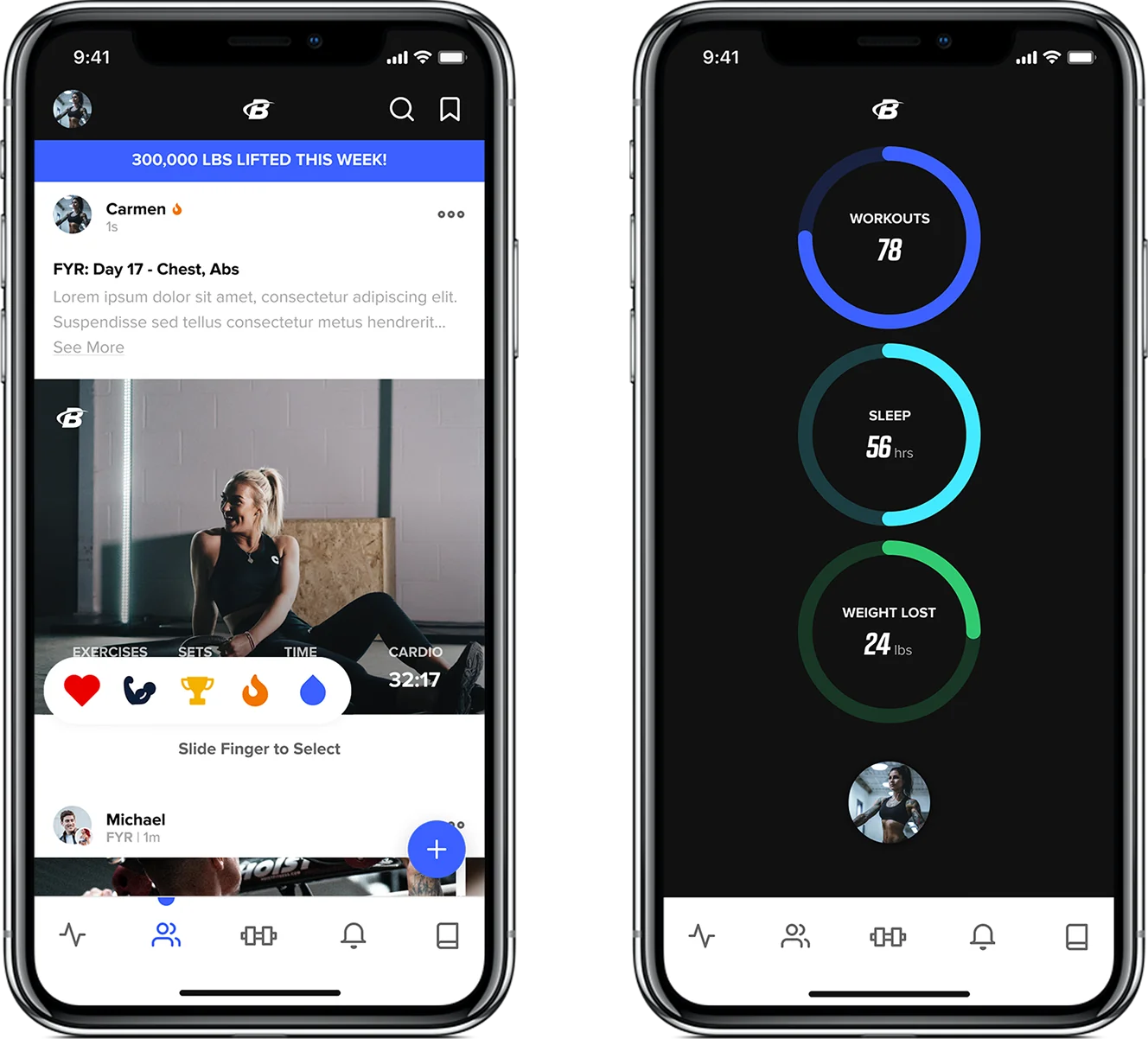
An Elevated Experience to Help Achieve Fitness and Health Goals
Empathy
Designed a people-focused experience around community and support.
Delight
Made the user experience more relevant, refined, and delightful.
Innovation
Laid the groundwork for a modern and sleek experience that sets apart the brand from their competition.
Impact
Rapid workshop, ideation and prototype to increase internal product vision and development
Solving a Problem
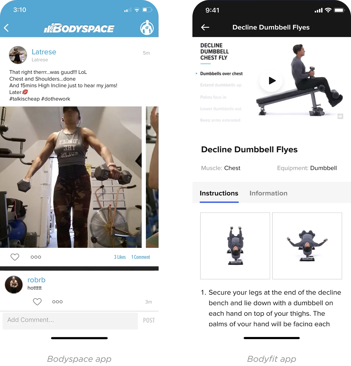
BodyBuilding.com, an online platform dedicated to help fitness enthusiasts achieve their fitness and health goals had two distinct mobile applications with separate but related uses. One for finding and tracking workouts and another for community support. These separate applications produced challenges and a missed opportunity to maximize and integrate all that they offer in a singular hub for all their user’s fitness and holistic health.
Casting the Vision with User Empathy
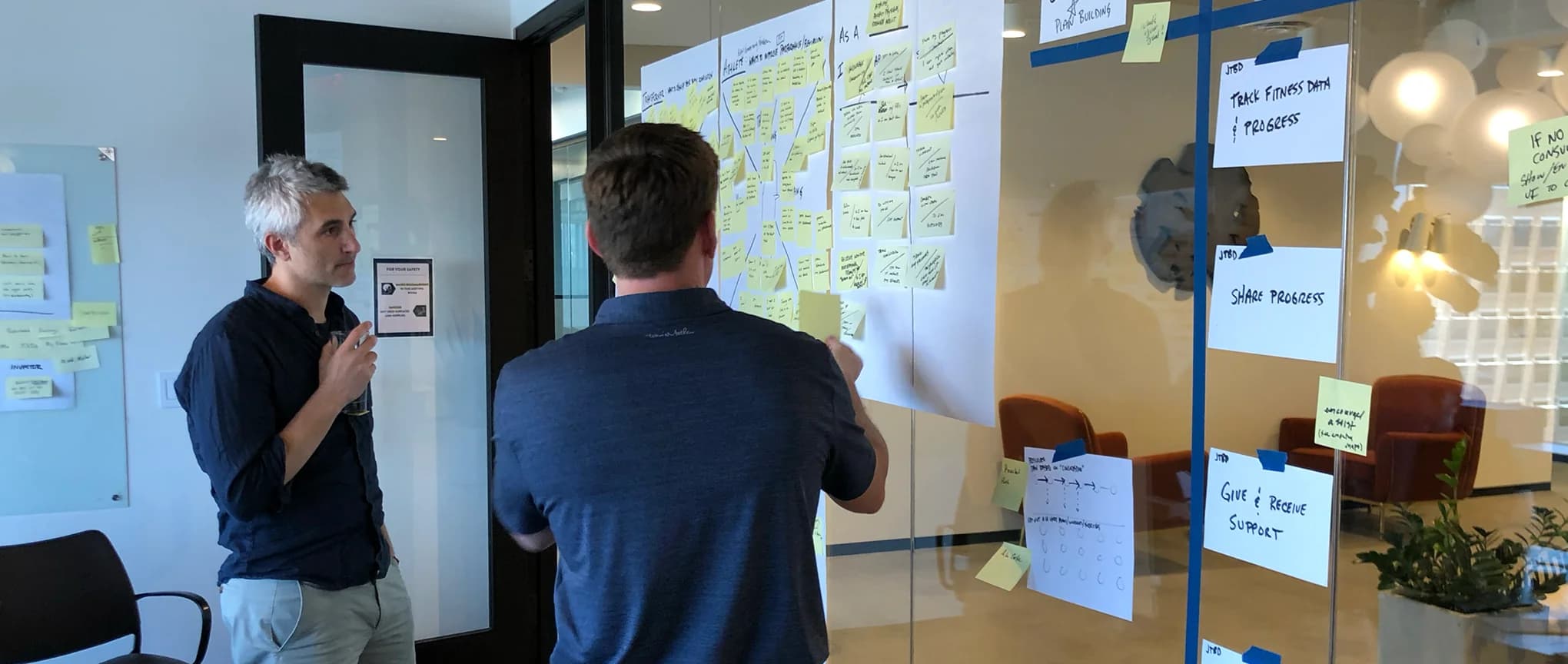
BodyBuilding.com already had a well established user-base that had grown accustom to how to perform tasks and work within the existing experience. This meant that we needed to collaborate with the BodyBuilding.com team in a series of user empathy exercises using the established personas in defining an ideal experience that will cultivate growth, innovation, and loyalty without alienating existing users. This process helped set the foundation for what key problems the product needs to solve in order to be meaningful to all users.
Making It Tangible with Visual Design
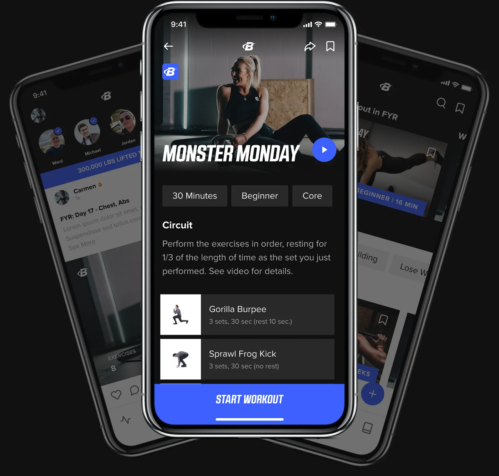
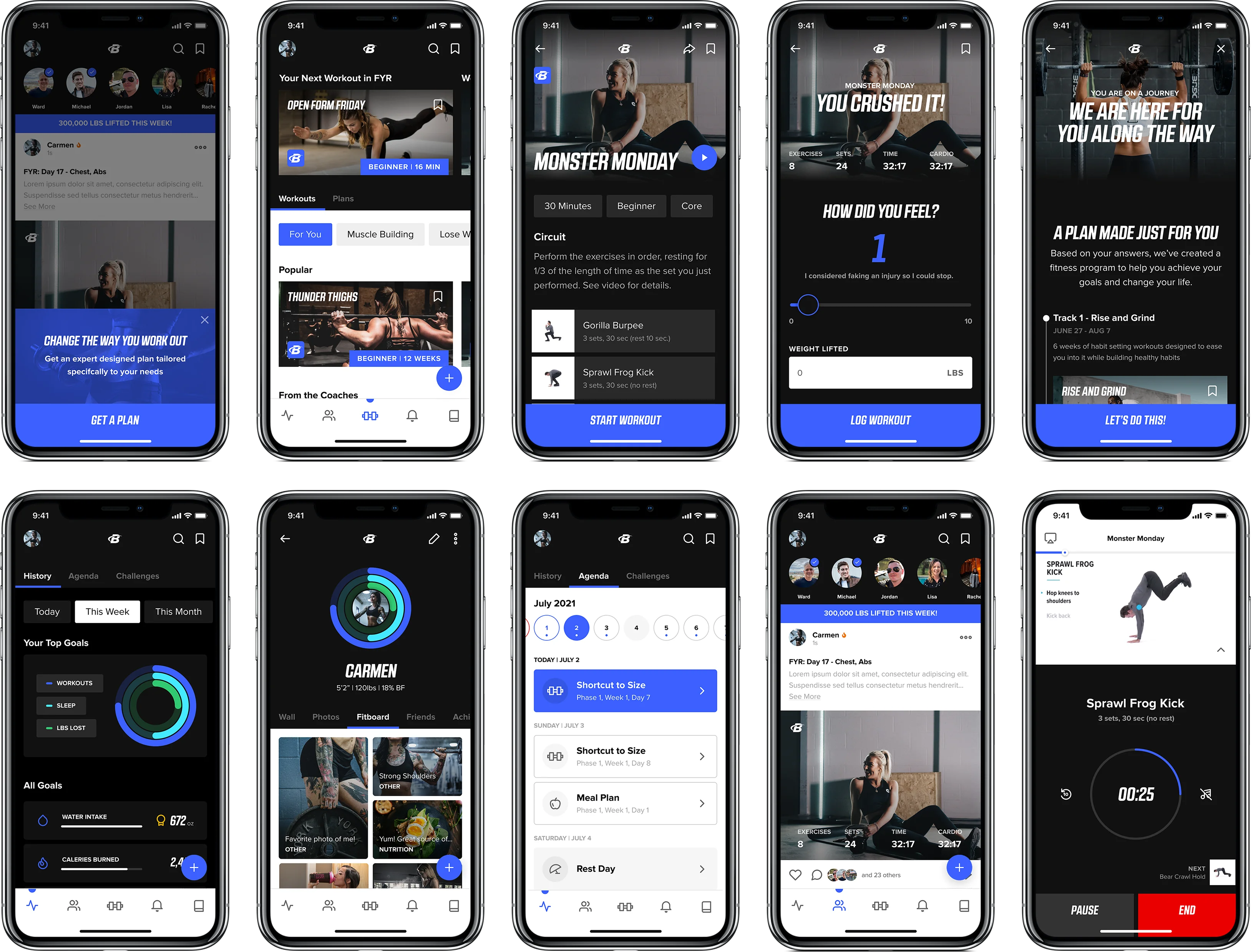
After creating a clear vision and collaboratively sketching solutions, Drawbackwards started to make the concepts tangible with hi-fidelity designs. Within this process we were able to take the newly redesigned brand feel and define how everything worked together and explore the more nuanced details that make an experience delightful. Our goal was to design an interface that was modern with an intuitive user experience that promoted user loyalty with interactions such as assisted moments and strategically placed content and functionality.
Bringing It to Life with Prototyping
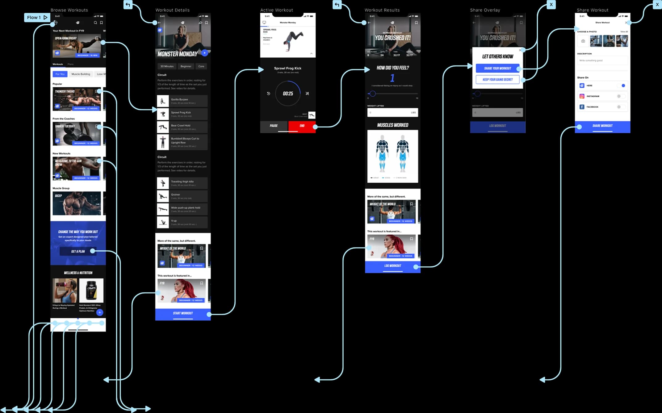
In order to most effectively present the new concepts to stakeholders, Drawbackwards brought the static designs to life as a clickable prototype. In this, we were able to illustrate micro-interactions and show a near real-life experience of what it will be like to navigate and interact with the application from finding and performing available workouts to taking an assessment and getting expert curated plans to help users achieve their health and fitness goals.
Infuse Delight in Interactions
Once the new mobile experience was functional, usable, and comfortable for users, we kept working up the Experience Success Ladder to infuse delight into interactions such as reacting to friend’s posts or getting glance at your top goals.
