Apria Healthcare
Bringing New Healthcare Software to Market
Revenue
Went from proof of concept to revenue-generating platform.
Growth
Sparked growth with self-enrollment.
Innovation
Laid the groundwork for integrating with wearables and emerging tech.
Impact
First-time submission success rate
From Proof of Concept to Paying Customers
As a durable medical equipment supplier, Apria Healthcare experienced firsthand how frustrating the equipment ordering process can be for providers, suppliers, and patients. They acquired a platform called DMEhub because they saw how it made the experience better for everyone.
The creator’s initial version proved his concept for DMEhub, but the code, product design, content, and marketing needed to be overhauled to make it market-ready. Enter Drawbackwards. Through their UX subscription with us, Apria has launched a successful, revenue-generating product and found a partner who will help them continue to improve and innovate.
Strategize, Analyze, Prioritize
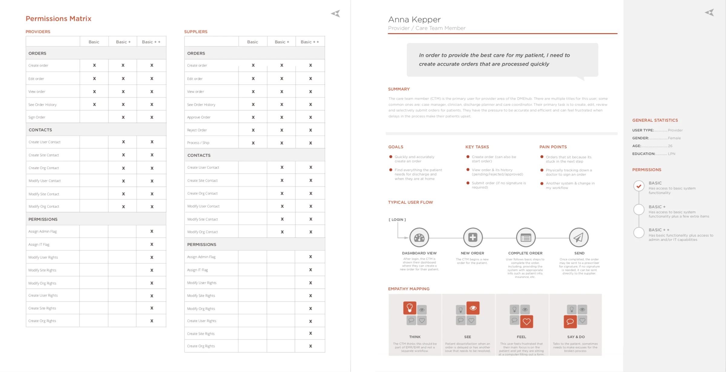
Our team began with a discovery process to gain a thorough understanding of the product and user types. We then completed a deep-dive UX analysis to uncover opportunities for improvement and prioritize users, needs, and features for the MVP launch.
Mapping the Journey to Optimize the Experience
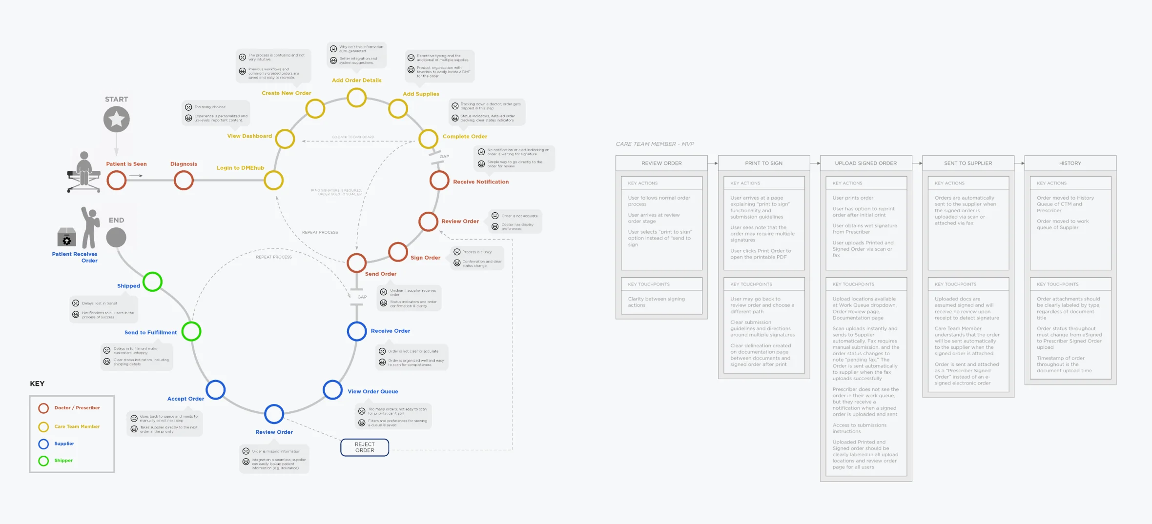
After narrowing down user types for the initial launch, Drawbackwards collaborated with Apria stakeholders across disciplines to map the user journeys. These journey maps added a layer to the typical process flowcharts and showed the users’ needs and feelings at every stage. By surfacing the highest and lowest points of the journey, we honed in on the workflows that needed the most improvement: those that are the most complicated (such as mobility equipment), and those that are used most frequently (such as oxygen equipment).
Putting the “Flow” in Workflow
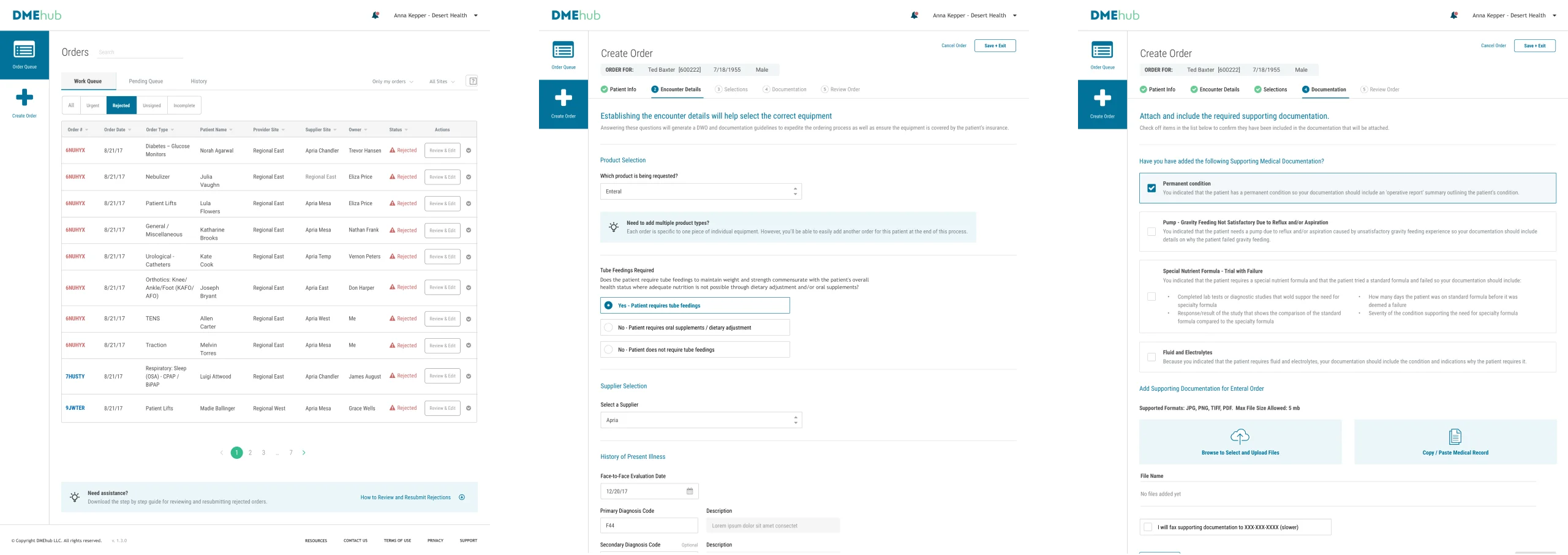
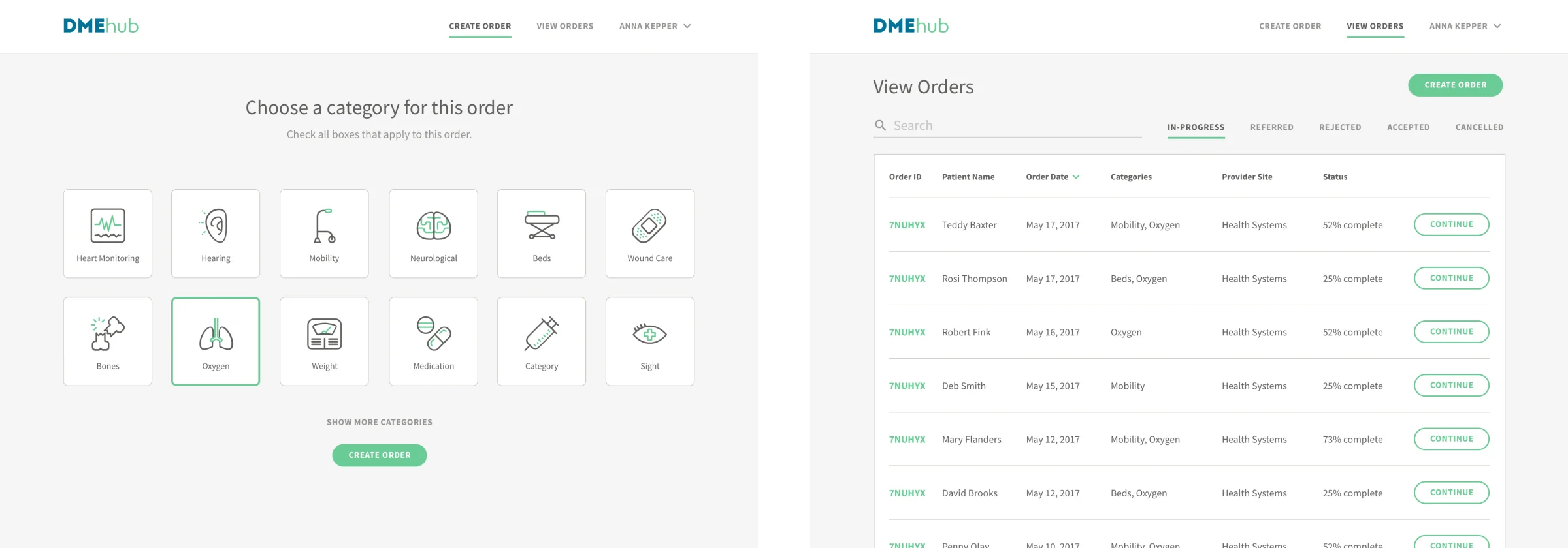
With a focused set of workflows in hand, our team began sketching and wireframing potential solutions that would achieve DMEhub’s vision and primary goal: helping users process accurate, complete orders faster.
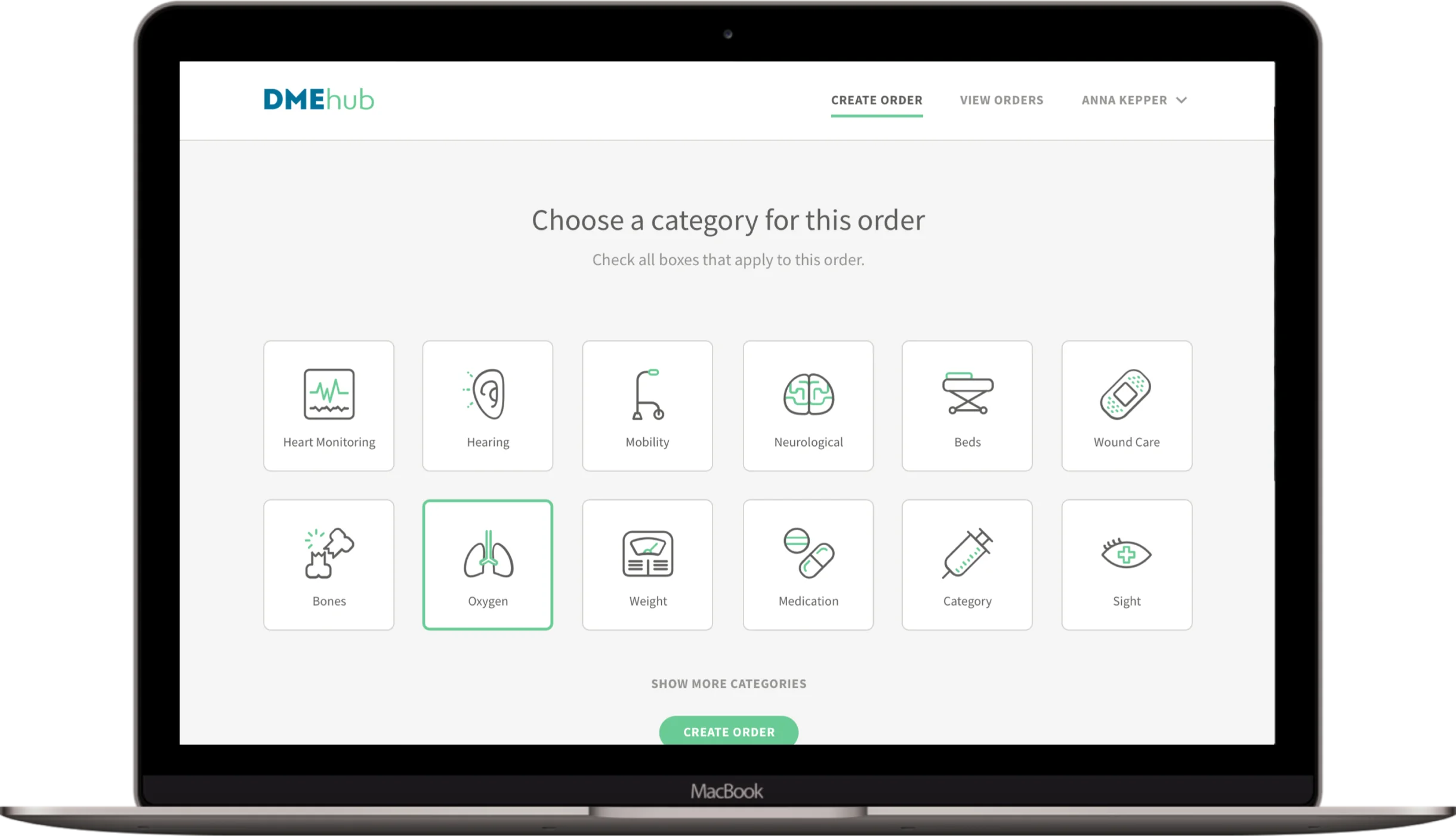
This goal may sound simple, but there were hundreds of products to choose from and thousands of rules about required documentation for each piece of equipment. To dissolve complexity and guide prescribers through the process, we designed a step-by-step experience that walks them through a series of simple questions. Then, the system uses if/then logic to help them gather the exact documentation needed. In the rare case that a supplier needs additional information from the prescriber, they can communicate with each other through the platform and resolve exceptions faster.
Less Complexity, More Simplicity
As we approached the design phase, Drawbackwards considered not only how DMEhub would look, but also how it would sound and work. Unlike most healthcare platforms, we made the DMEhub visual design clean and uncluttered. The copy also uses simple, clear language to guide users through the process. Our front-end development team then helped bring DMEhub to life, while ensuring that the design and content were implemented as planned.
Using strategic product design, product development, and UX copywriting, we helped Apria dissolve complexity and create a simpler, clearer user experience that was ready for primetime.
Marketing Support that Generated Sales
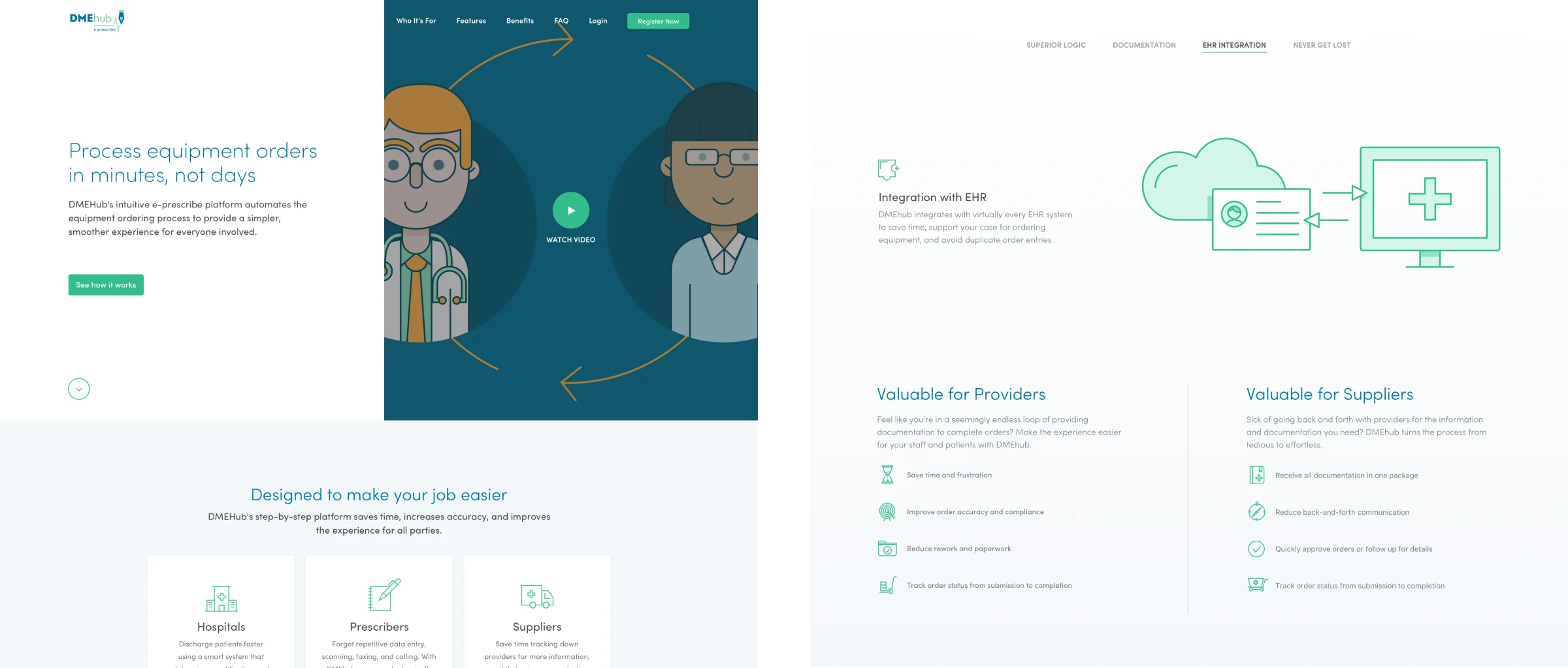
As we got DMEhub closer to being market-ready, Drawbackwards made sure the platform’s marketing was just as strong as the product. From a website, to explainer videos, to sales collateral, to email campaigns, to user guides, and more, we equipped the Apria team with all the tools and documentation they needed to sell the product and onboard customers.

Getting User Input to Identify Improvements
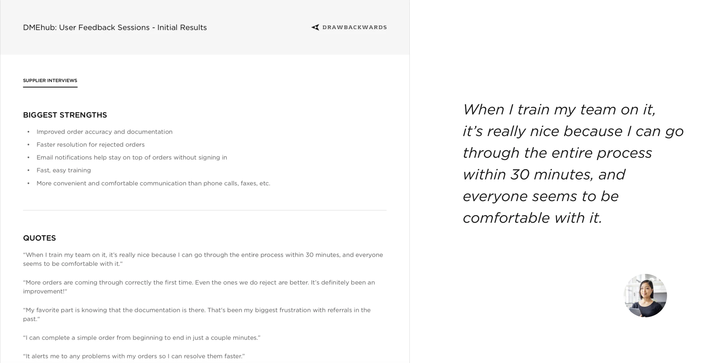
Within weeks of launch, Apria had successfully acquired several customers and started processing orders. Our team believes the design process is never done, and we were anxious to hear from real users. To gather their feedback, we planned and completed usability testing, surveys, and one-on-one interviews. The insights gathered from this user research have informed improvements across product design, development, and marketing.
Planning for the Future
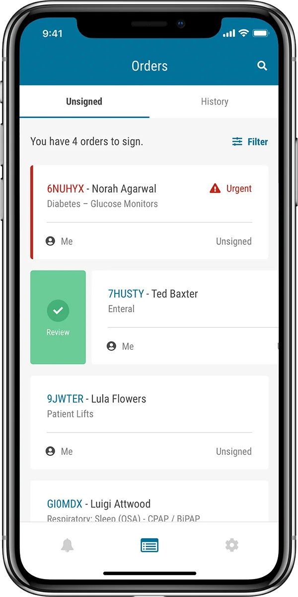
Apria and Drawbackwards have only scratched the surface of what’s possible. While optimizing the current user experience, we’re also working together to design what the future will look like for DMEhub. From self-enrollment to wearable prototypes for signing orders on the go, we’re collaborating with the Apria team on innovations that will push DMEhub to the next level.
With their UX subscription, Apria has been able to quickly move from initial product design, to front-end development, to marketing, to polishing UX copy, to reworking flows based on user feedback, and more. Thanks to our partnership, DMEhub went from square one to having paying customers, and laid the groundwork for future success.
