Acclaris
Building a Better Experience for Account-Based Health Plans
Simplified Complexity
Simplified terms and user flows so the average user could easily manage their personal account.
Problem Solving
Addressed countless different error and completion states.
Collaboration
Worked with the in-house team to produce time-efficient UX solutions.
Impact
Enterprise sales revenue based on new deals closed with prototype
Delivering on the Promise of a New Acquisition
In May 2015, global professional services company Towers Watson acquired Acclaris, a provider of software-as-a-service technology and services for consumer healthcare and reimbursement accounts like Health Savings Accounts (HSAs), Health Reimbursement Arrangements (HRAs), and Flexible Spending Accounts (FSAs). With adoption of these types of accounts and plans rapidly growing, Towers Watson was looking to the expertise of the Acclaris team to help its employer-clients offer their employees benefits in new and cost-effective ways.
Acclaris was already working with 6,000 employers, including more than 40 Fortune 500 companies, to support 1.4 million of these accounts with its global services and operations and its scalable and configurable SaaS-based technology. However, it didn’t have a dedicated in-house user experience design team. It needed a partner to help make sure it could deliver seamless support for employers and an exceptional experience for their employees while growing to meet the new expectations of the recent acquisition.
Collaborating and Co-Creating for Success
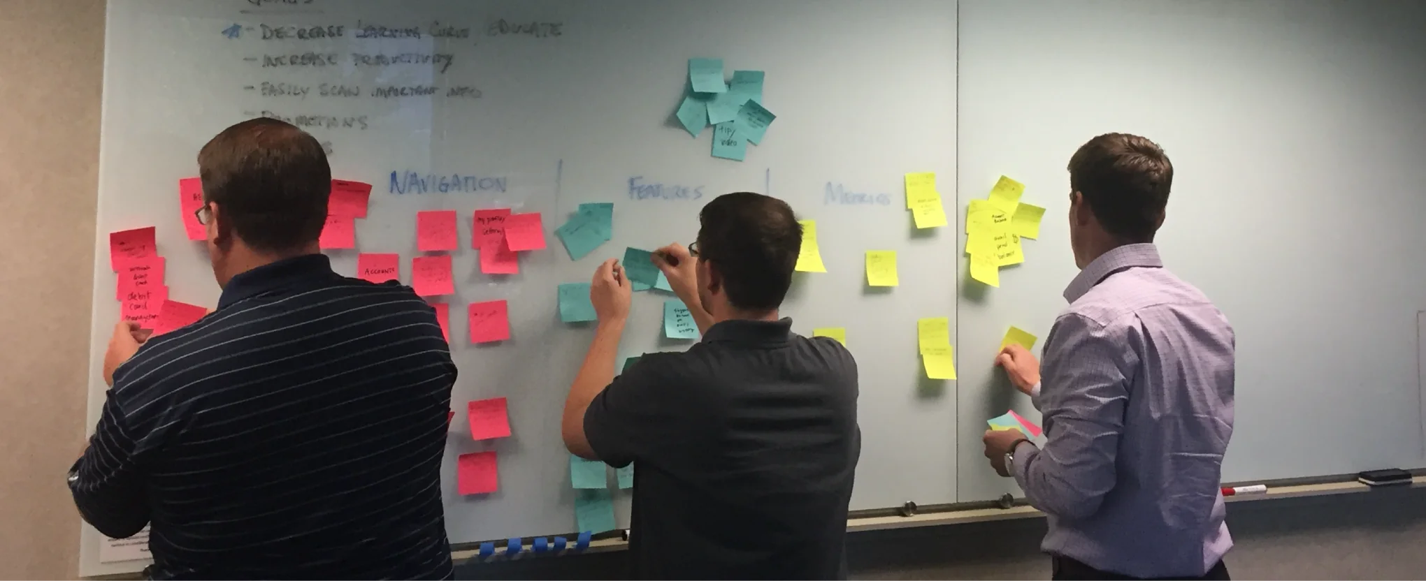
We began our relationship as a traditional consultant to Acclaris, helping align the team, establish the right direction and lead them to solutions. We did this by facilitating workshops where we took a leadership role in showing them how to solve their problems. As Acclaris began to build its own in-house design team and mature as a UX organization, our relationship evolved into more of a partnership. Drawbackwards filled in the gaps in the Acclaris team with our experienced world-class talent that could tackle the heavy design challenges, while reviewing and advising on the work of the in-house team.
As business decisions were made, the Acclaris team took on more responsibility to set the direction and our Drawbackwards team adjusted to meet their needs. We worked alongside the in-house team to stay aligned every step of the way through weekly meetings, designated communication channels, and ongoing project workshops. Thanks to the open communication and good relationship that we established from the start, we were able to evolve with their business constraints and keep wasted time and unnecessary hassles to a minimum.
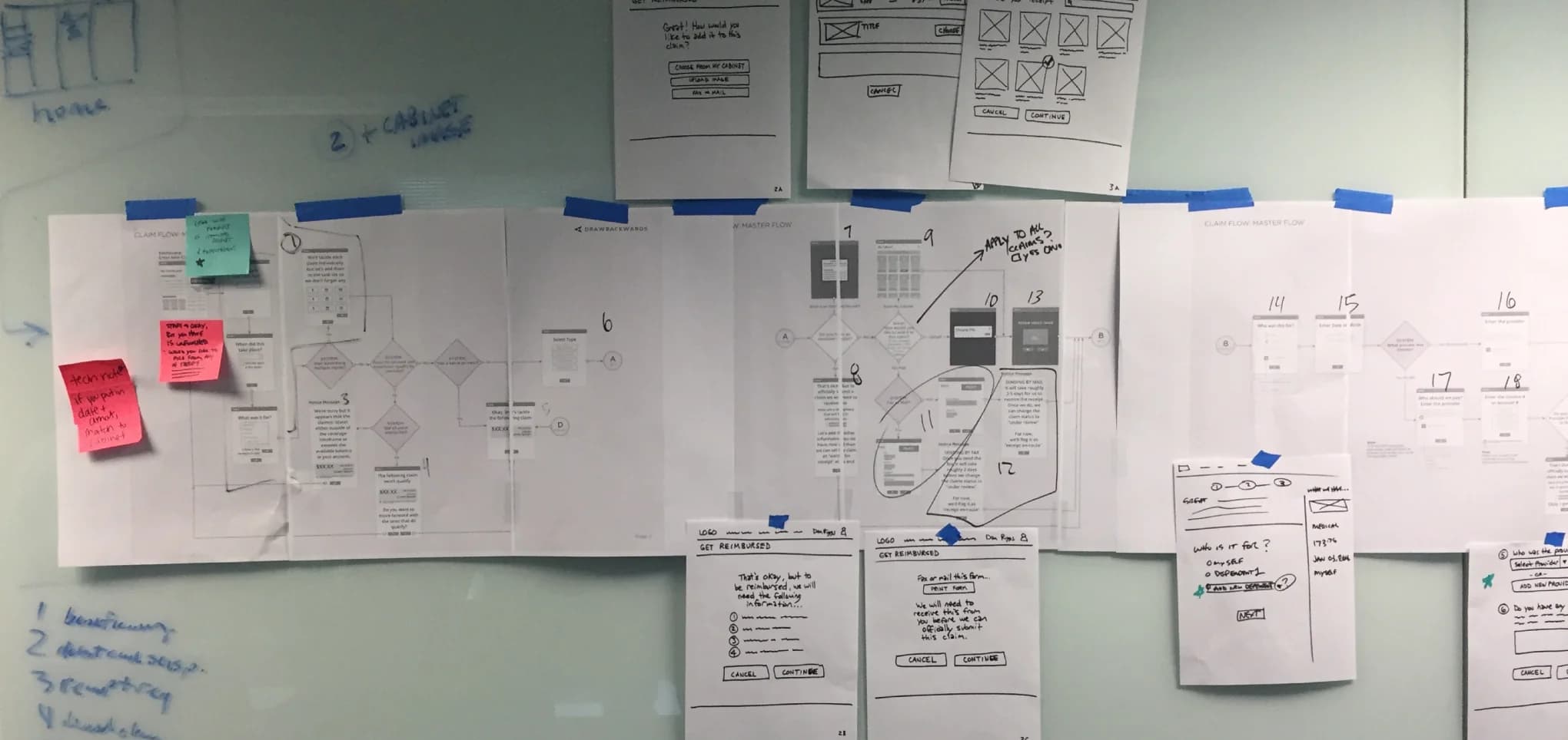
One of the best tools that helped us effectively collaborate and co-create was live sketching. In these sessions, we sat side-by-side with the Acclaris team as they described the problem to us and we sketched potential solutions. They would give us feedback, and we would do more sketching until we had something that felt right and ready for prototyping. These sketching sessions would often be embedded in longer workshops where we could also create robust user flows to account for every potential state and user action. This allowed Acclaris to be the source of truth to outline for us the pains so we could help them find a UX-focused solution.
Dissolving HSA Complexity to Create Simplicity
Health Savings Accounts (HSAs) are not the easiest products for any regular person to understand, but they get even more complex once you get under the hood to see how they work. Our first step was to learn as much as we could from the Acclaris team about HSAs, the benefits they provide to consumers, and how they function on a practical account level. That baseline understanding would be the foundation of how we were going to help make this complex product and service easy for end users to understand. In short, they taught us about HSAs so we could show them how to make those HSAs more useful in layman terms.
We had long discussions with the Acclaris team about just the basic terminology used in the industry and what effect each term or action had on an individual account holder. For example, we had to understand the difference between a reimbursement, a withdrawal, and a contribution so we could create designs that made it clear to end users where their money or benefits were going and why.
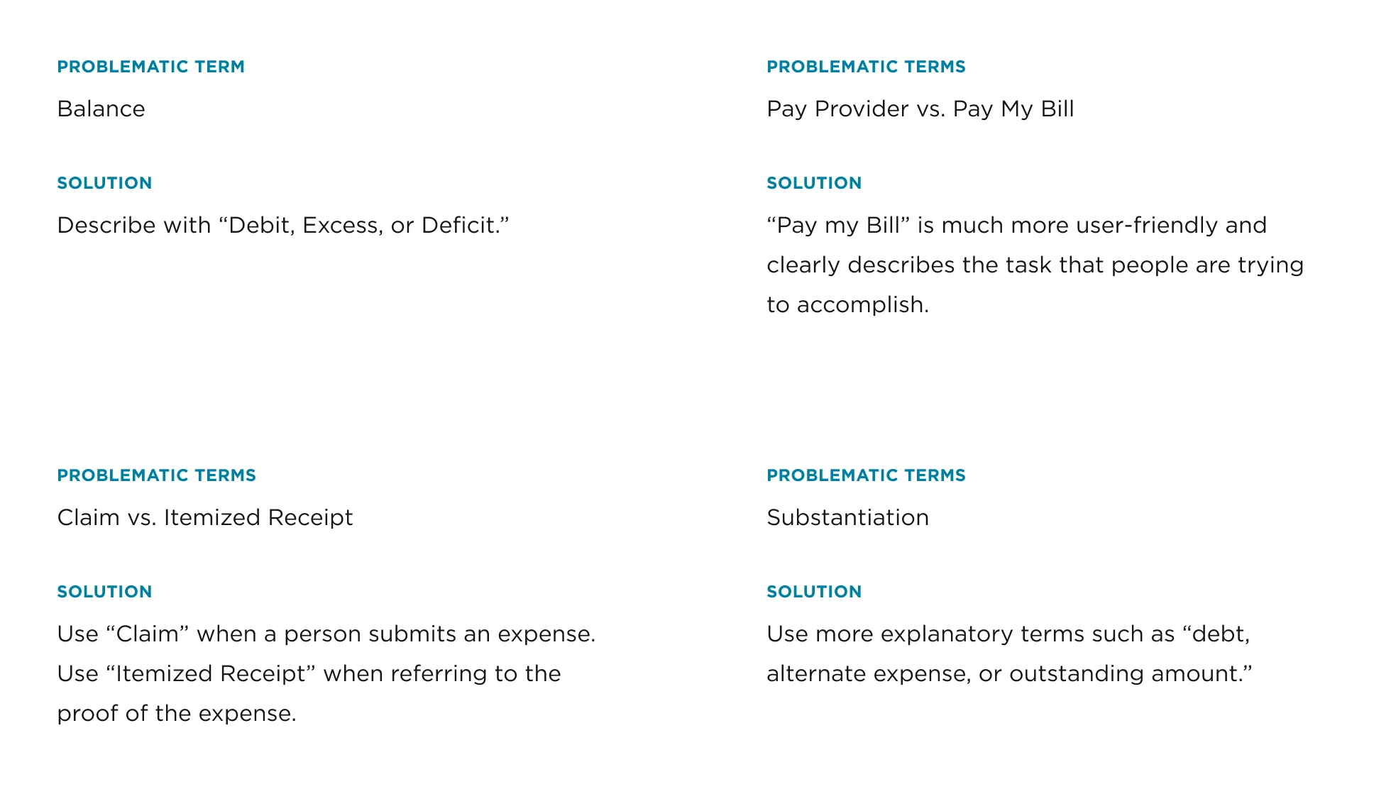
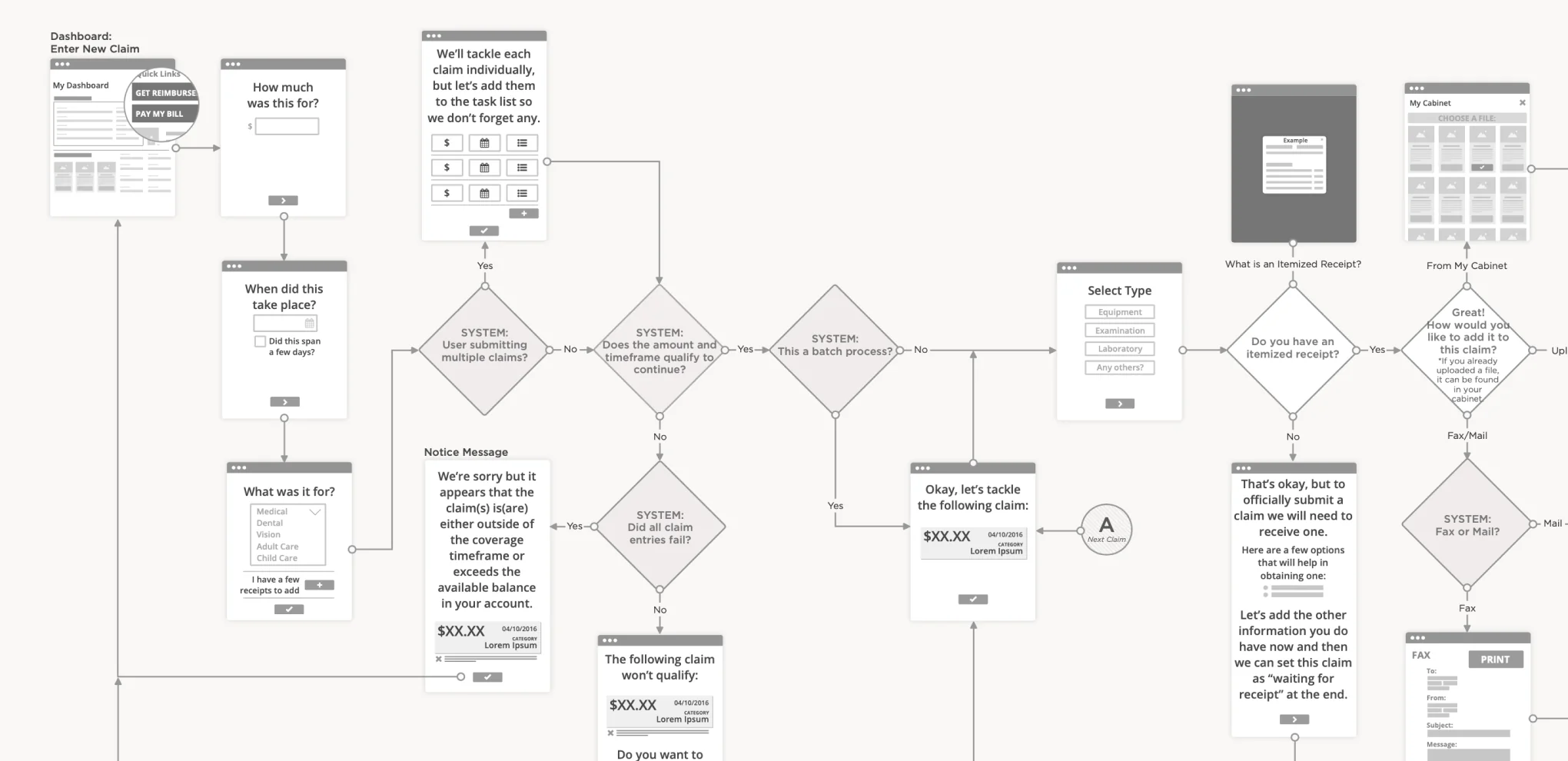
We helped turn the Acclaris vision into reality by identifying the core needs and tasks of the user and the business first and then establishing a clear action plan to address those needs. To do that, we took the time to build a master user flow with six sub-flows that represented all of the potential variations in accounts and processes.
By dissolving the complexity behind the core product and identifying the specific things that are unclear to normal people, we could help the average user more clearly understand how to effectively manage their accounts and benefits.
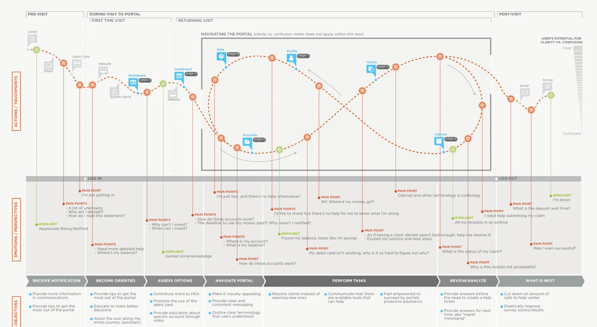
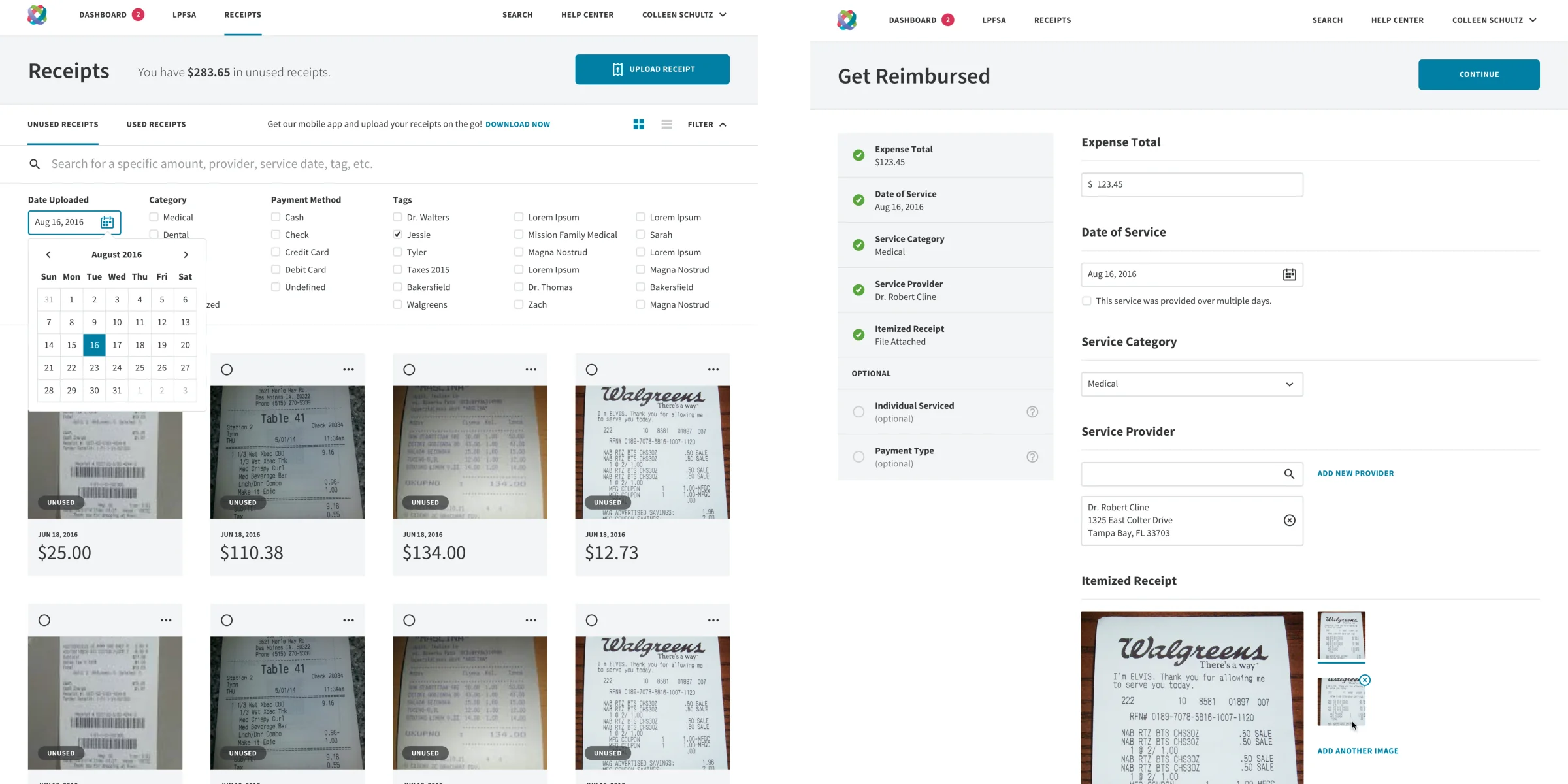
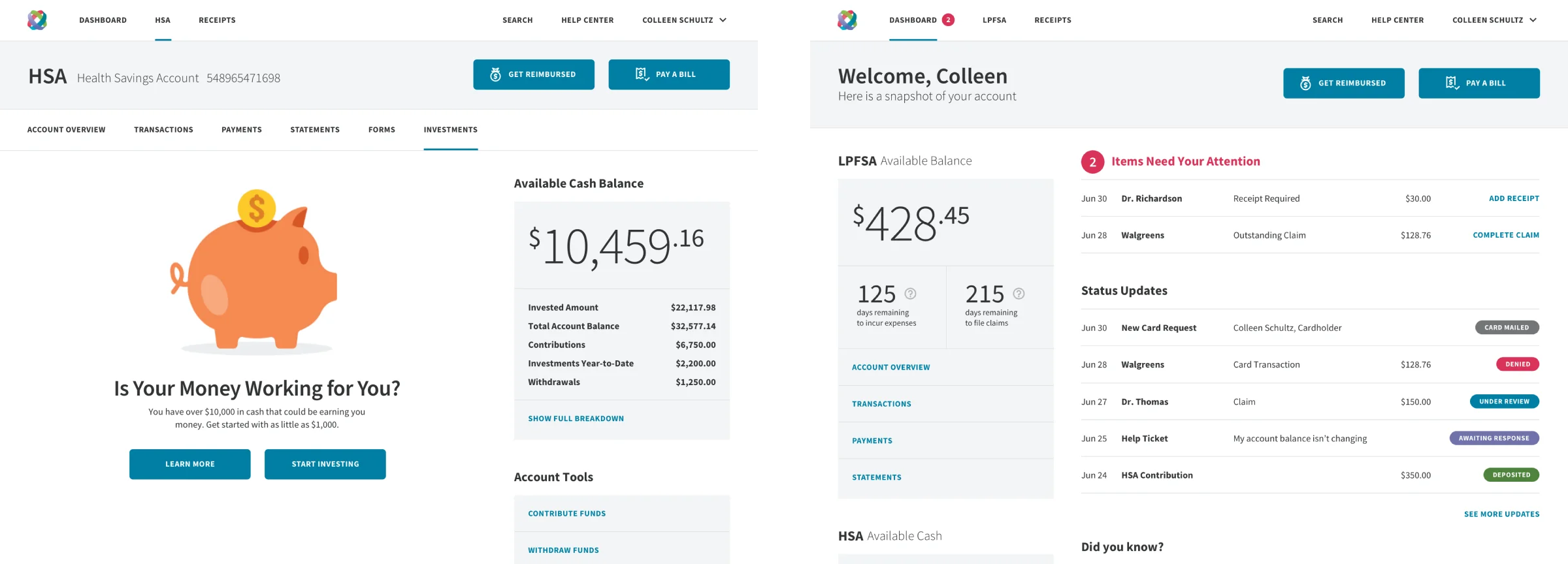
Those flows allowed us to identify where to place assisted moments — pop-ups that recognize what the user is trying to do and offer help with the process — as well as simple forms and designs to take the burden of complex thinking off of users. Along the way, we solved a number of problems for the user and the business by addressing countless different error and completion states, thinking through how to effectively visualize necessary data, and identifying what parts of each flow could be handled and owned by the system.
Putting Everything in the Right Place at the Right Time
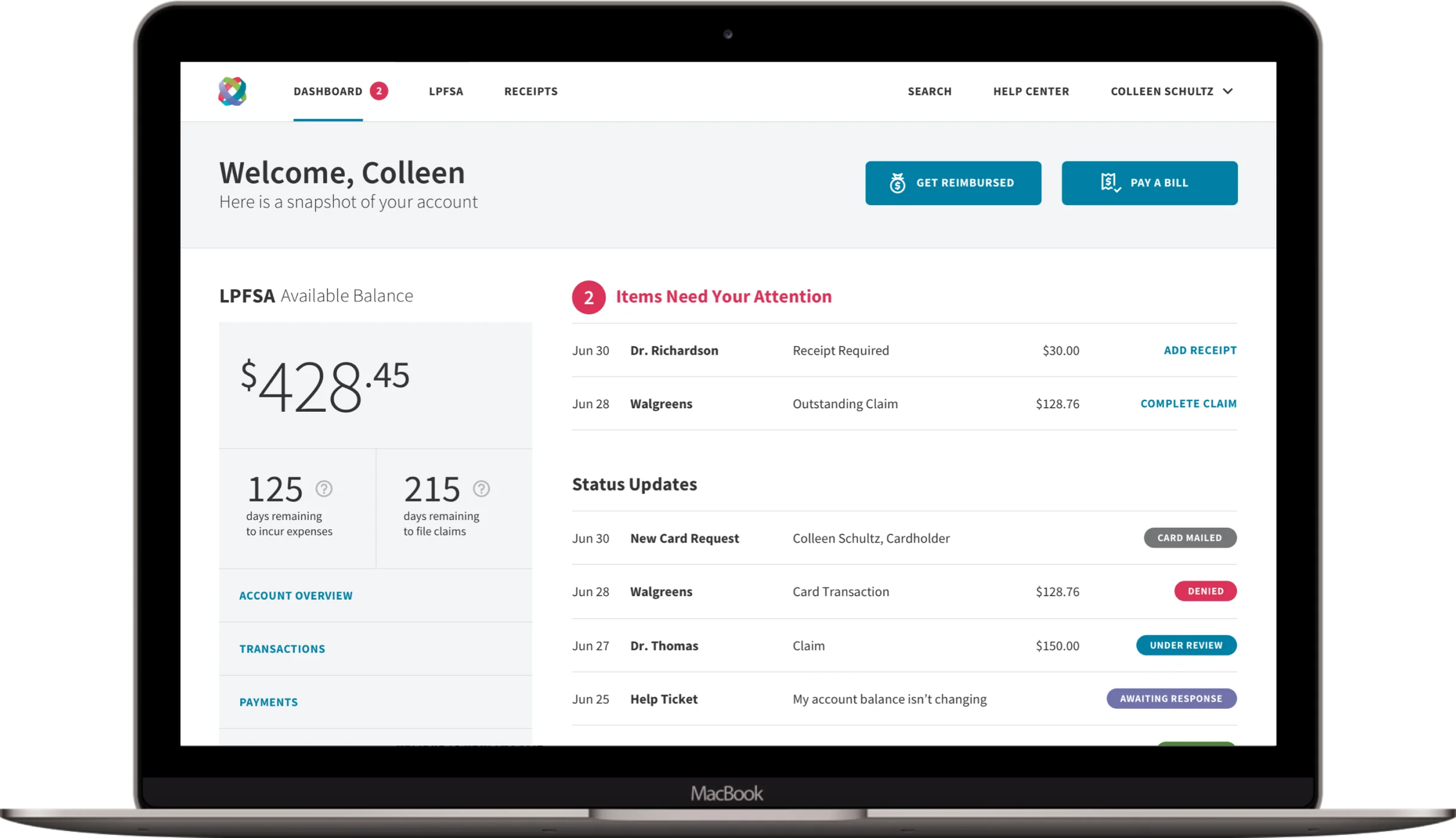
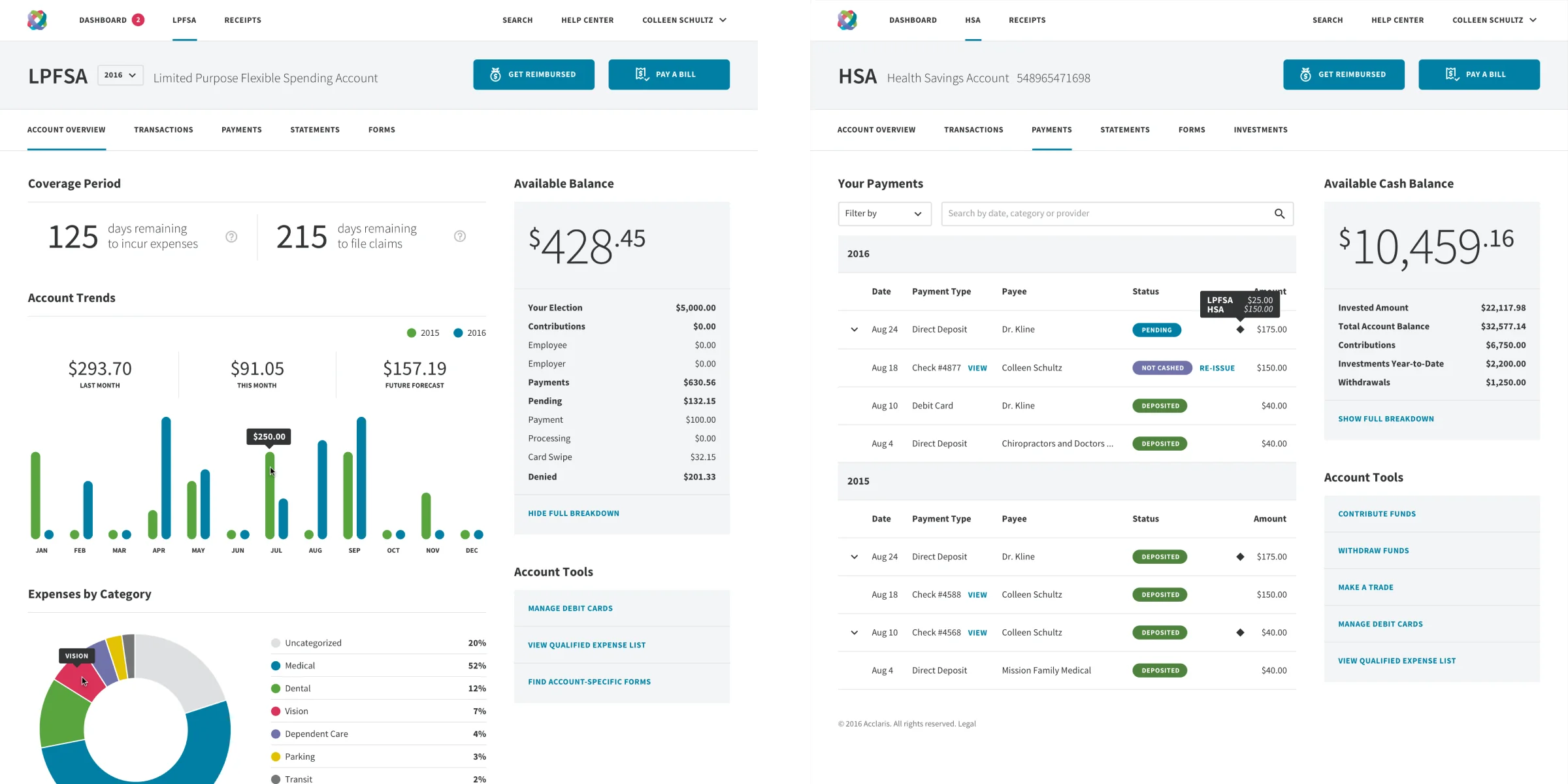
By the end of the engagement, we had worked with the Acclaris team to achieve their ultimate goal of putting the right information in the right place at the right time in the simplest form possible for users. When we started, the system didn’t clearly indicate to the end user the most important information they needed to know — the total amount of money in their HSA or how they could spend and manage that money. We helped deliver a carefully designed dashboard that not only told users what they had, but gave them the timeframe in which they could use it, and simplified complex information about how to spend it.
The medical industry is a complex web of processes, regulations, products and services. It takes real UX experts to help simplify that complexity for regular everyday people. Acclaris helped us understand the intricacies of their business and legal regulatory environment so we could produce designs that not only look pretty but actually solve real-world problems. That deep level of business understanding is what sets a mature UX organization apart from the rest.
Drawbackwards provided a bridge to help Acclaris mature as a UX-focused organization with the eventual goal of building a full in-house UX design team. Acclaris had the proven track record in delivering health care to a growing market. They just needed our UX expertise to help them stay on track and focused on the end user as they navigated their evolution.