Act!
Breathing New Life into an Aging CRM
Design
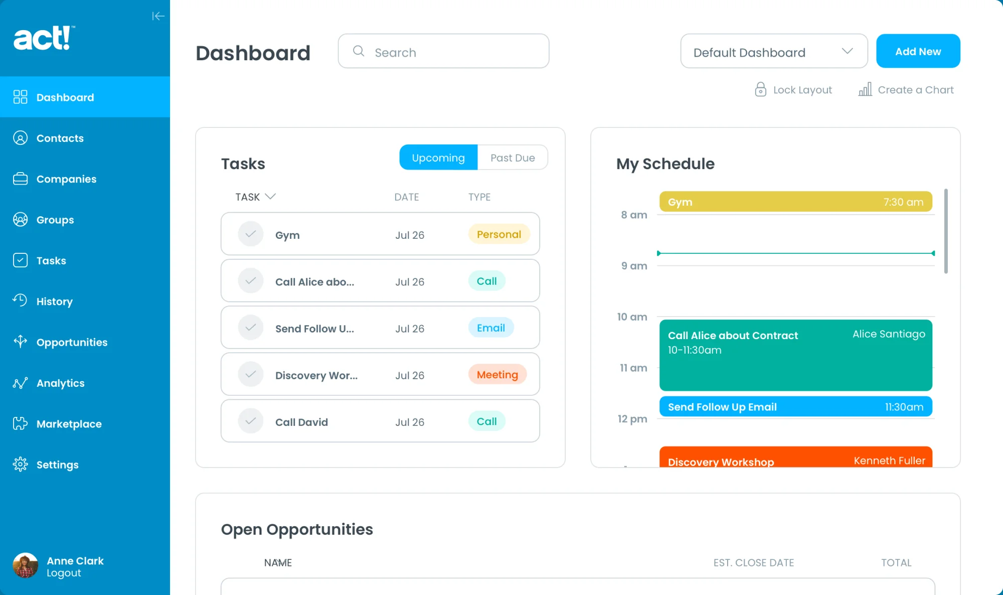
Merged the old with the new to shepherd a beloved tool into modern times.
Strategy
Used research to generate a cohesive free trial product experience.
Partnership
Worked hand-in-hand with the client team to free them up to maintain the business while we drove innovation.
Impact
Speed to software product design and development
Modernizing a Classic
Named Activity Control Technology when first launched in the 1980s, and later named Automated Contact Tracking, Act! has been a beloved and trusted tool for a whole generation of small and midsize business owners. It was the best-selling Windows contact management software in the 1990s and is still one of the most recognizable legacy brands in the Customer Relationship Management (CRM) space.
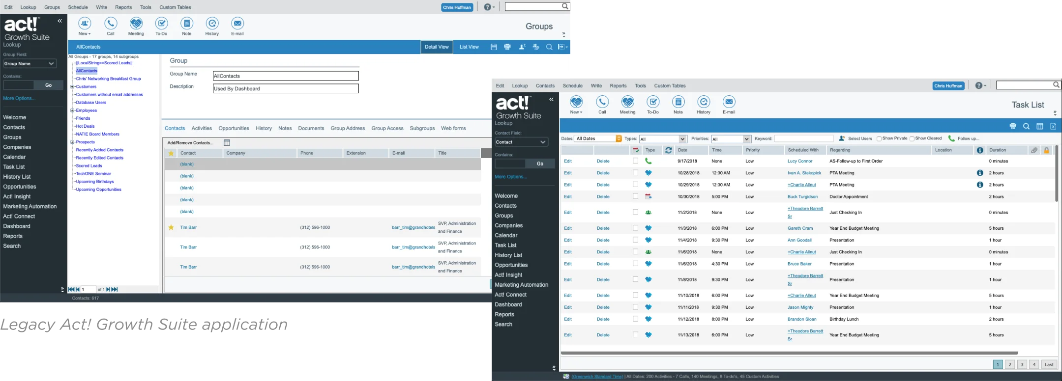
At its height, Act! was installed on millions of PCs worldwide to help business leaders track their interactions with business contacts, sales leads, and existing customers. With the rise of cheaper cloud-based solutions, the software was starting to look old and out of touch.
In 2013, Swiftpage — a Denver-based software company — acquired Act! and set out to shepherd the legacy platform into the modern age by turning it into a robust all-in-one cloud-based solution. The goal was to cement Act!’s reputation as a CRM leader. In 2020, Swiftpage even changed its company name to Act!
Crafting a Modern Cloud-Based CRM Solution
Swiftpage was facing several core challenges when they enlisted the help of Drawbackwards.
First, they knew they needed to preserve the core functionality that legacy users loved about their installed Act! product. It had a reputation as a leading CRM solution and these devoted users didn’t want to give up what they liked. They were also very reluctant to transfer their data to the cloud. Swiftpage had no desire to leave these users behind in the transition to a new product.
Second, they needed to build a new version of Act! that could appeal to a younger generation of business leaders who have a wide range of marketing automation and social media integration tools at their fingertips. They expect a subscription-based model that allows them to explore the product with free trials and customize it to their needs. Swiftpage needed to shift from a license-based sales model to a subscription cloud-based product to appease this new generation of users.
Finally, Swiftpage needed to integrate new products and external plug-ins and build new features, as needed. To do this, they needed to understand the gap between the CRM tool that the legacy Act! was and the robust solution they wanted to build. They asked us to help find the quickest and most effective way to fill that gap for their users.
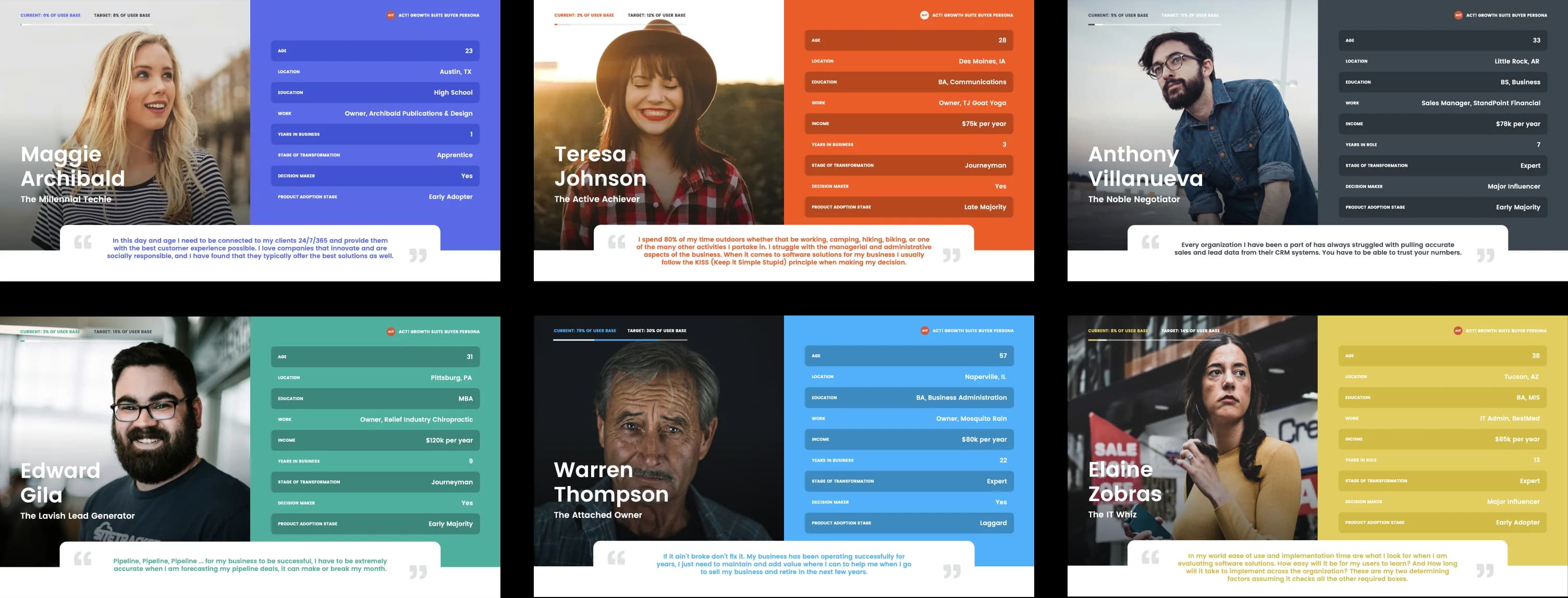
Identifying (Old and New) Target Personas
We started where we always do — with the user. In this case, there were two main sets of users. The existing users of the legacy product were in their 60s and resistant to change. The new target users were in their 30s and looking for social media integration and marketing automation features.
Swiftpage already had a general understanding of their target users and their needs. We worked with them to clarify specific user personas so we could focus on the features that would make the biggest difference.
Building User Empathy Through Research
We designed a usability study to understand the day-to-day experience of legacy users: how they used the product, which features they relied on, and where the experience broke down. We measured the UX of the existing product using our proprietary survey tool to set a benchmark, then showed users prototypes of next-generation features. We learned they didn’t want to lose customization capabilities but loved the modern look and feel, and were more open to planned third-party integrations than expected.
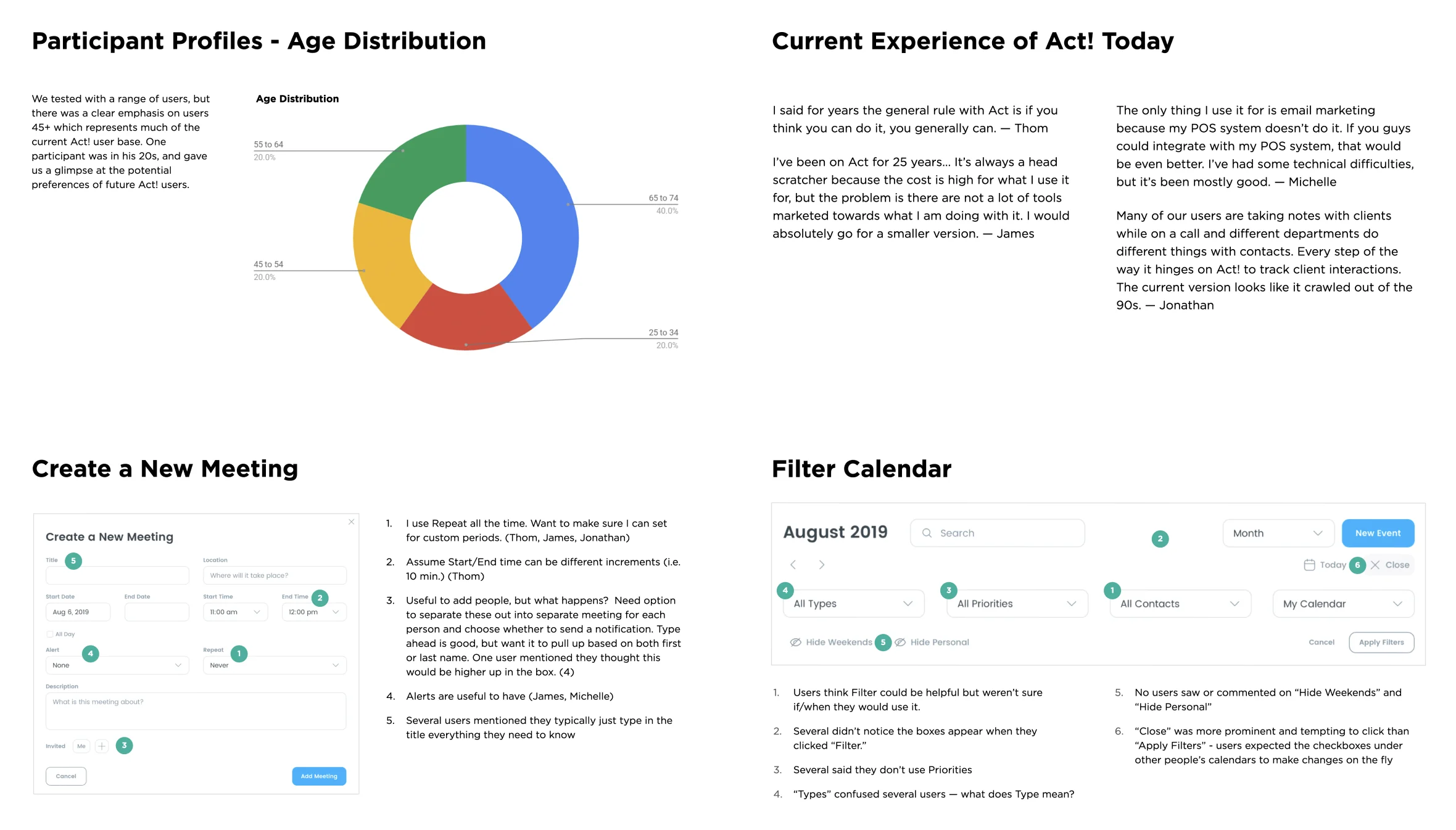
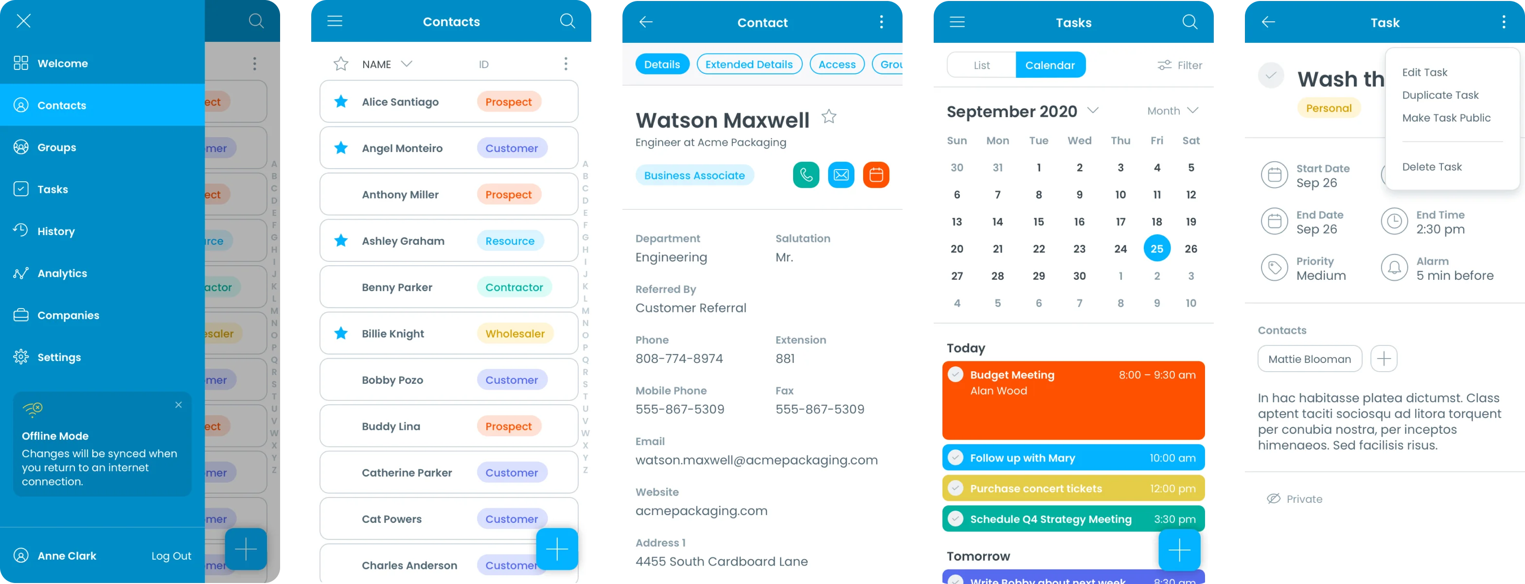
We showed them prototypes of a next-generation version of two core features in the product (Calendars and Tasks). We wanted to understand their existing pain points with these features and test our initial ideas for solutions. We also wanted to get a sense of any obstacles to the idea of adopting a new version of the program.
This usability study gave us a solid baseline for understanding a key user persona that would be crucial to our success. We learned they didn’t want to lose the customization capabilities of the current product (even if it was for ease of use). But they were open to many of the third-party integrations planned for the future. We also learned they didn’t like the old-school design and loved the modern look and feel of our initial prototype.
Designing Two Products in Tandem
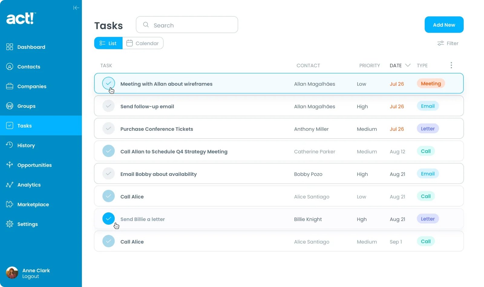
With research insights, we iterated faster on design ideas and developed concepts for two separate products in tandem. The first, called Nexus, was going to be the CRM platform of the future. By setting the groundwork for Nexus, we could ensure the next iteration of the legacy product — Act! Growth Suite — could evolve together with complementary features and a consistent look and feel.
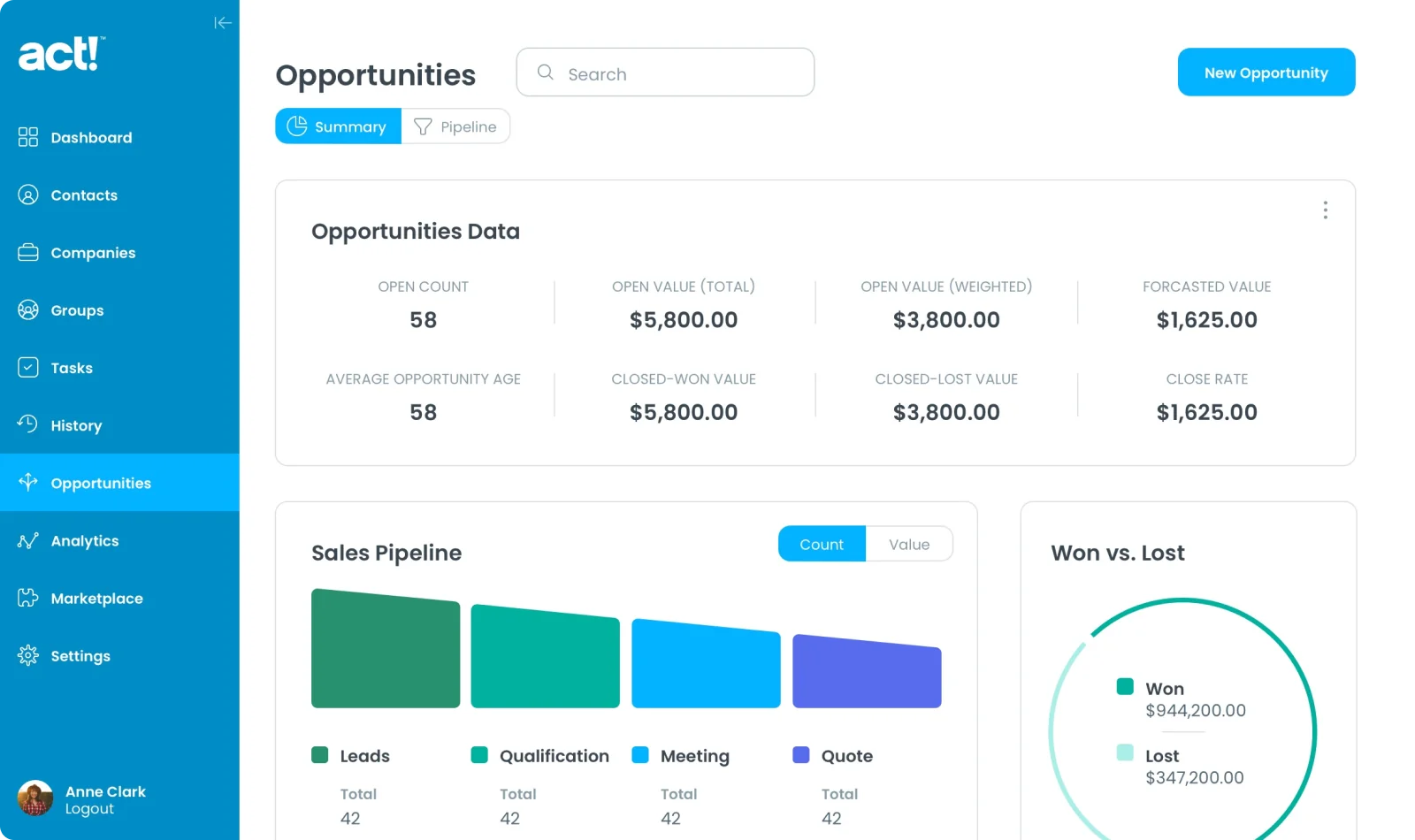
The first product, called Nexus, was going to be the CRM platform of the future. Initially available for Mac and Windows, it would later move to a cloud-based SaaS product.
By setting the groundwork for Nexus we could ensure that the next iteration of the legacy product — Act! Growth Suite — could evolve and grow together into Nexus with complementary features and a consistent look and feel.
Building a Competitive Free Trial Experience
People expect to try a product before they buy it. Our three-pronged research approach focused on user interviews with recent trial customers, a heuristic analysis of the trial experience, and a competitive analysis of best practices for free trials with similar products.
The research helped us identify where the free trial was failing users and how that failure was impacting their desire to buy. We helped revamp the entire onboarding experience from welcome emails to the features offered in the trial.
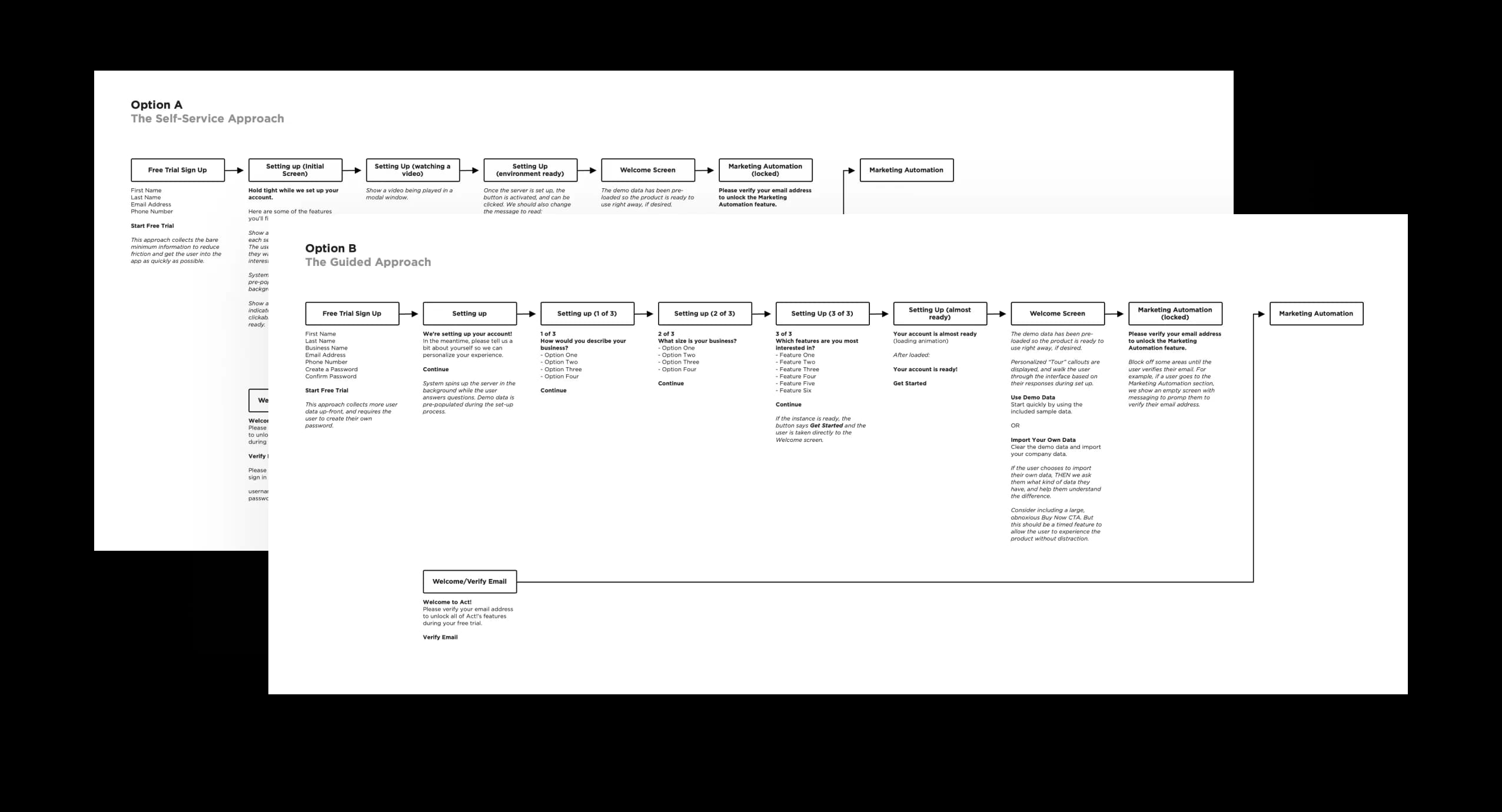
The research helped us identify where the Act! Growth Suite free trial was failing users and how that failure was impacting their desire to buy the product. Users are busy and have very little time to test each product. To stay competitive, they need to immediately see if Act! Growth Suite can do what they need it to do.
Our heuristic analysis uncovered many of the pain points that users told us about in the usability research but we were able to apply our UX expertise to offer immediate quick fixes. An intuitive interface is essential for making a good first impression. By becoming familiar with the initial user experience, we were able to ensure we helped the Swiftpage team build a consistent experience for users from day one.
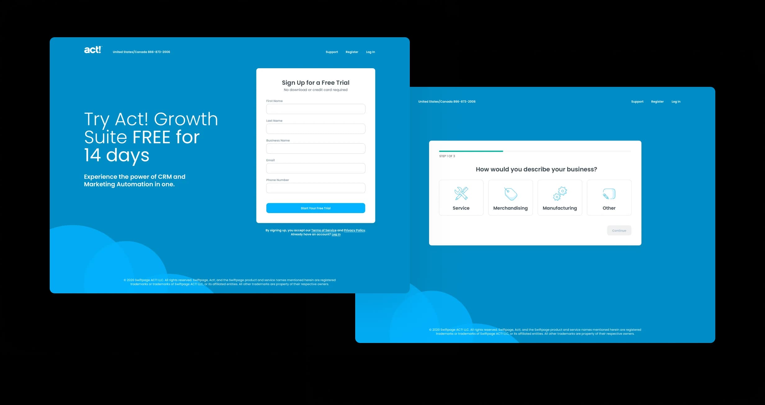
Finally, the competitive analysis helped us understand the role of free trial experiences in the buying journey. There may not be an in-person sales consultation, but users still need and want a consultative experience. They need the feeling that the company is listening to (or at least aware of) their needs. They want to know that the product will help them get the job done. They also need a human they can reach out to for questions. That process becomes a proxy test for long-term customer service capabilities.
A clear, easy, and intuitive Free Trial is the very first step to building long-term loyalty. With these research insights, we helped revamp the entire onboarding experience from welcome emails to the features offered in the Free Trial.
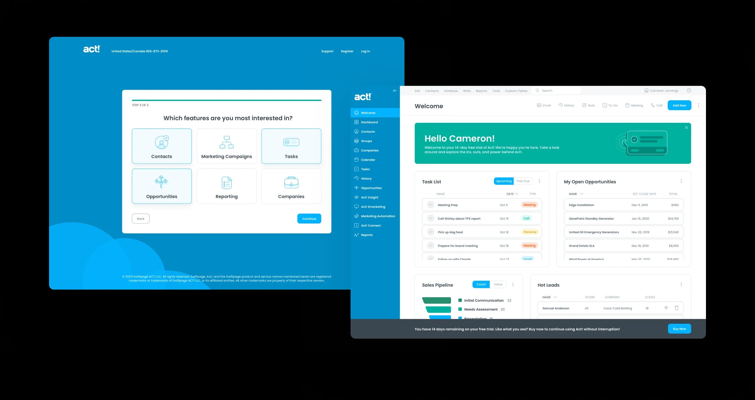
Expanding In-House UX Capabilities
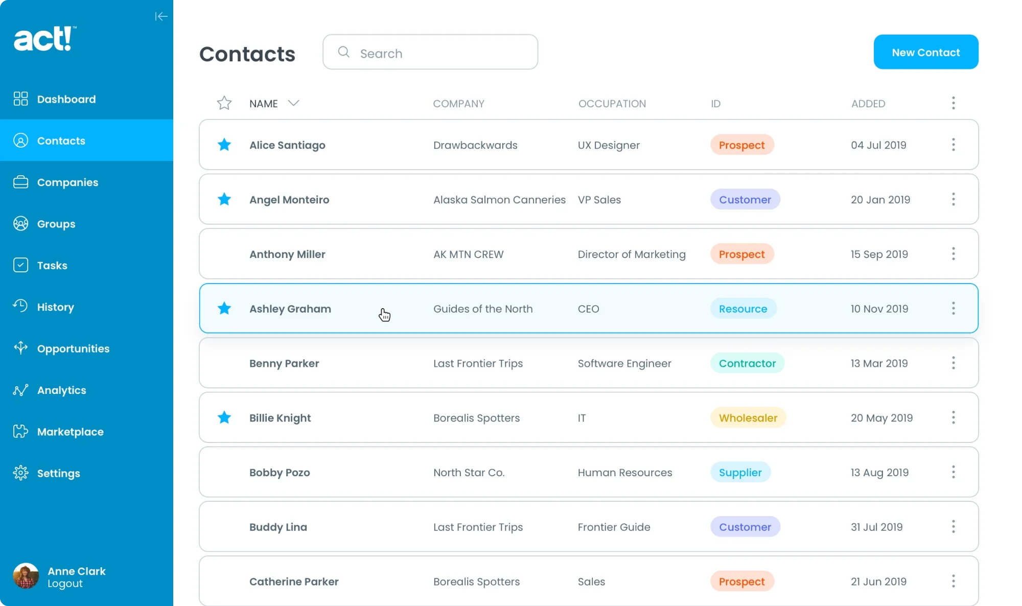
Drawbackwards functioned as an extended design team for Swiftpage, allowing their internal team to focus on urgent product needs while we drove innovation and set a vision for the future. We elevated the product’s aesthetic from its dated 1980s and 90s styling toward modern cloud standards, delivering wireframes, prototypes, and high-fidelity designs that accelerated Swiftpage’s organizational maturity in UX capabilities.
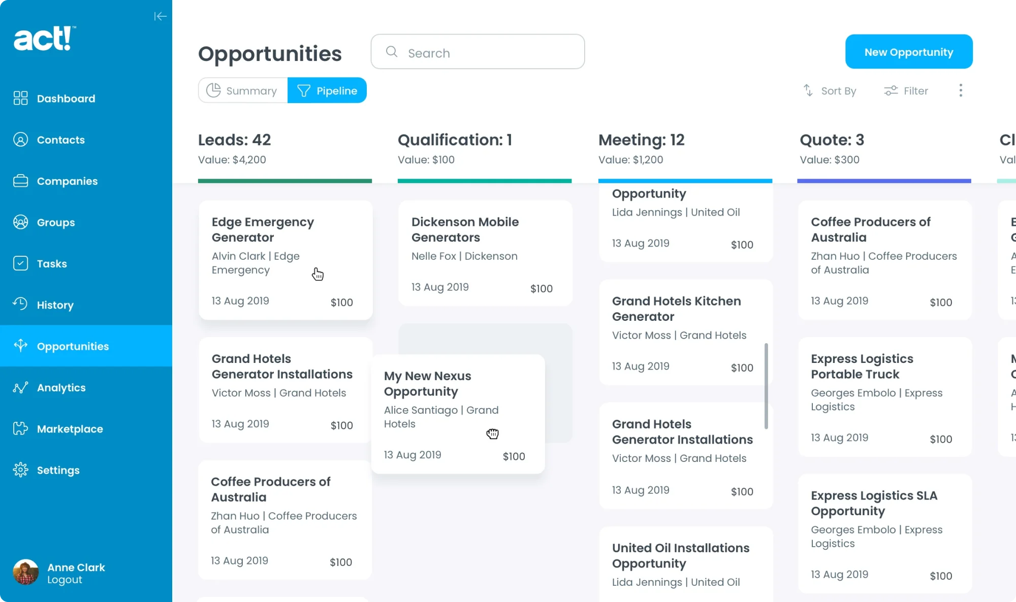
A More Cohesive Product Experience
Our team was a valuable extension of the Swiftpage product and design team. They could focus on urgent product design needs while we ideated, designed, and iterated toward the future. Our collaboration gave them a head start on building a more robust internal UI/UX capability.
Through user research, UX strategy, design thinking, and open collaboration, we delivered a look and feel that gave them a clear direction for the future — putting a modern face on a game-changing product to build user loyalty and ensure continued success for decades to come.