Equality Health

Poorly Organized User Interface Leads to Missed Healthcare Opportunities
HealthBI, the technology division of Equality Health, built a flagship platform called CareEmpower to unify fragmented healthcare systems. CareEmpower is a web-based application that empowers healthcare payers and providers to deliver an exceptional patient experience while lowering the cost of care and improving clinical outcomes.
CareEmpower was intended to help medical practitioners stay on top of scheduling the highest-risk patients, managing their referrals, and recommending proactive care opportunities for their entire roster of patients. The problem was that the product was never designed with the end users - front desk schedulers and medical assistants - in mind. The user interface was dated and poorly organized, which often resulted in confusion, inefficient workarounds, and ultimately missed healthcare opportunities.

Crafting a More Efficient Way to Deliver Healthcare
HeatlhBi’s clients are healthcare providers who have their own systems for managing their Electronic Medical Records (EMRs) for their patients. The value that CareEmpower offers these clients is a more efficient way to manage their EMRs so they can schedule patient visits to deliver the best treatment plans possible and not let any patient slip through the cracks.
A common use case for CareEmpower would be for a front office scheduler to easily see details about each patient across their whole patient roster. Ideally, the application would identify the patients at the highest risk and automatically flag them in a simplified list so schedulers knew who to get in to see the doctor first. The system needs to bring these patients to the attention of the front office staff.
The HealthBI team knew the product wasn’t reaching its full potential so they asked Drawbackwards for help as thought partners and UX design leaders. They wanted to use data analysis to make it easier to see which patients needed to be scheduled and eliminate the need for front office staff to do extensive searches to find and call the right patients. The product was able to create quick lists of high-risk patients, but it wasn’t able to proactively highlight when those patients needed to be called and scheduled.
By ensuring a streamlined scheduling process, CareEmpower could ensure successful patient visits and treatments and even make it easier to refer those patients to specialists for other ongoing treatments.
Building a Pipeline for Patient Care
We began the engagement with a series of discovery and strategy workshops to review and analyze HealthBI’s existing materials, such as persona documentation, user flows, and user research. We also participated in a demo of the existing product to familiarize ourselves with the current state of the application and begin to understand the primary pain points.
From these workshops, we started to see that it would make sense to approach this problem like a sales pipeline. We essentially needed to help front office staff track patients through a funnel to follow up and schedule them at the right time.
To do this right, we needed to design a user interface that would support that funnel approach. We first completed a heuristic evaluation of the existing UI to get a feel for the current user experience. This audit focused on the main workflows within the application, called out quick wins, and identified the existing UI/UX barriers that prevented users from getting their jobs done.
From there, Drawbackwards hosted a one-day ideation workshop that drove the team towards a laser-focused product roadmap to inform the sprints that lay ahead to build a smarter and more responsive CareEmpower product.

Meaningfully Improving the Main Jobs-To-Be-Done
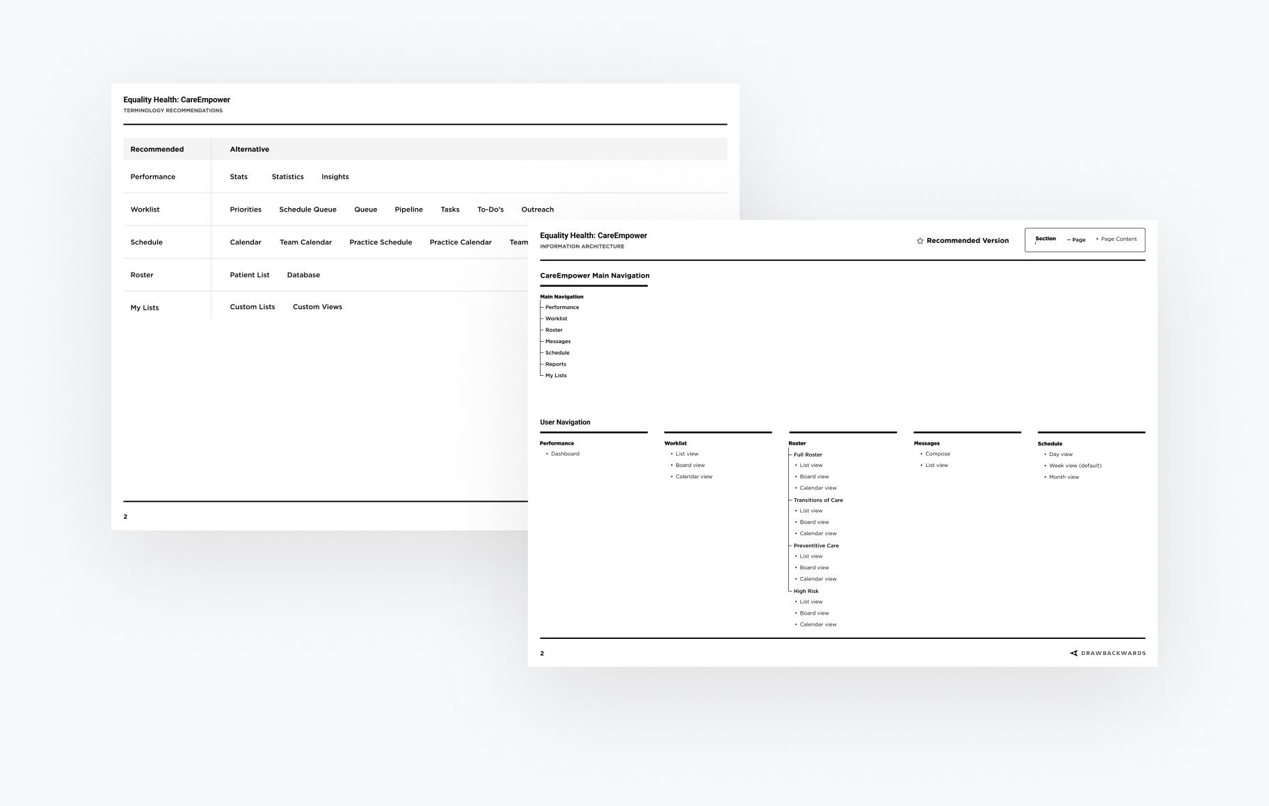
With a solid understanding of the existing product and pain points and a clear roadmap, we started making meaningful improvements to the application. First, we evaluated the terminology used in the navigation and made recommendations for clarity, ensuring we were speaking the same language as our users.
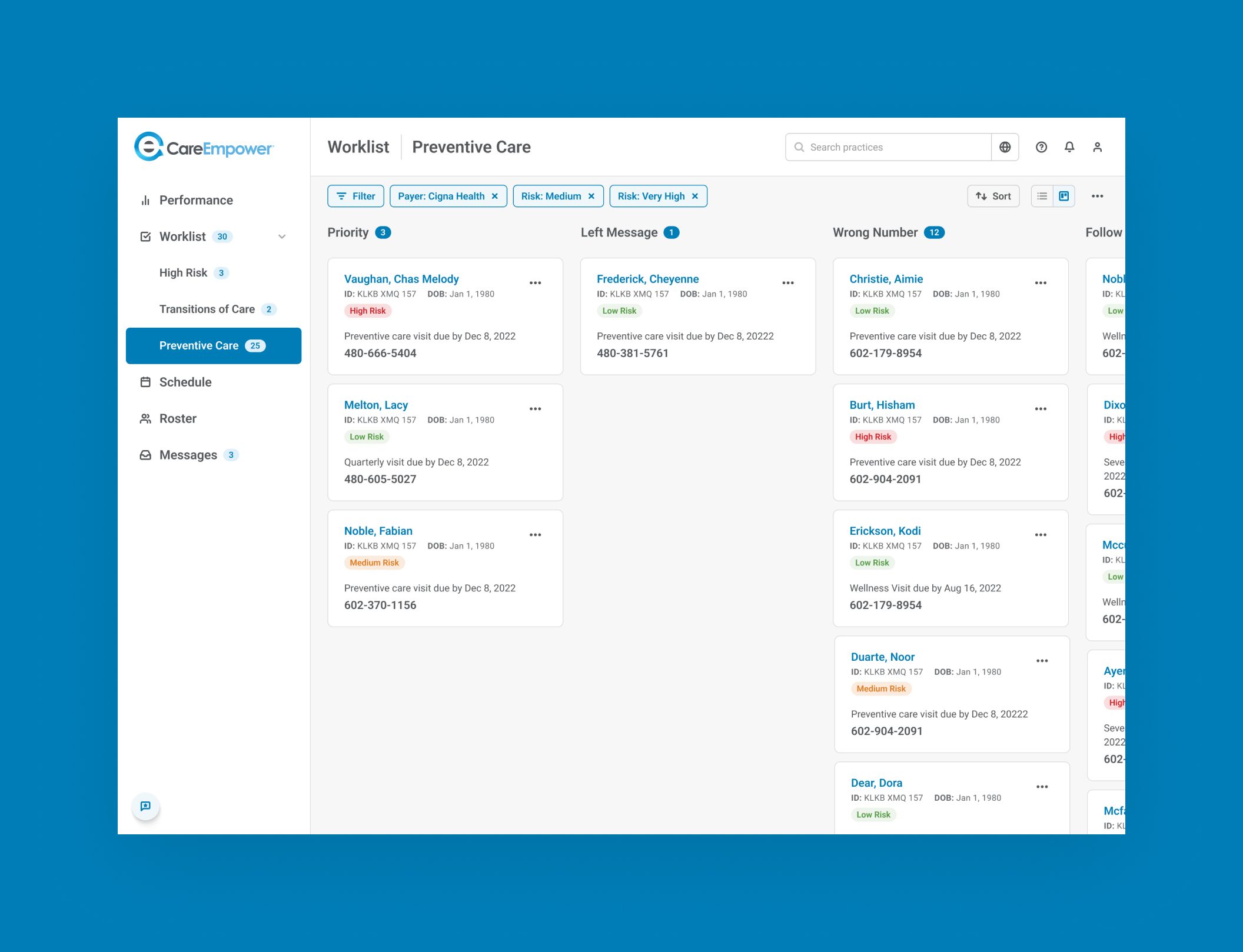
We also updated the information architecture by organizing the content into a “Worklist.” This allowed us to arrange the UI around the users’ main jobs to be done — calling patients and getting them scheduled. The new interface essentially transformed the static patient database into a trackable sales pipeline that allowed users to focus on the highest-risk patients and greatest needs.


We looked at what information we could surface to which users at specific points in the flow. This helped us create a new hierarchy of information and access to that information that made it easier to see what was needed to schedule a patient. We also greatly simplified the information being displayed for a simpler user experience that allowed staff to scan for the data they needed on the fly.
In order to work more effectively, we also needed to establish the foundation of a design system by assembling a library of reusable assets, including a full-color palette, typographic styles, size and spacing guidelines, and user interface components. This foundation can now be grown and refined over time.
Ideating and Testing to Reduce Complexity
With a better understanding of the users and a rough design system in place, we began working on the user interface for the framework of the application. We needed to decide how users would move around the application and complete the tasks that they needed to do dozens of times a day. We needed to identify the data that would help schedulers and medical assistants be more efficient and productive. We explored, considered, and refined multiple ideas before settling on a final application framework.
Once a framework was established, we began to focus our attention on how users would complete their primary tasks and how they move through those workflows. We talked to the client about what would make sense from their perspective, their needs, and their expectations. We reevaluated the way the content was organized and simplified the experience by removing unnecessary noise, which made it more intuitive and focused.


Iterating to Find the Right Fit
In the remaining sprints, we designed, iterated, and refined existing screens and flows, and all the supporting interactions. As we progressed, we added new screens to the prototype to continue our ongoing validation.
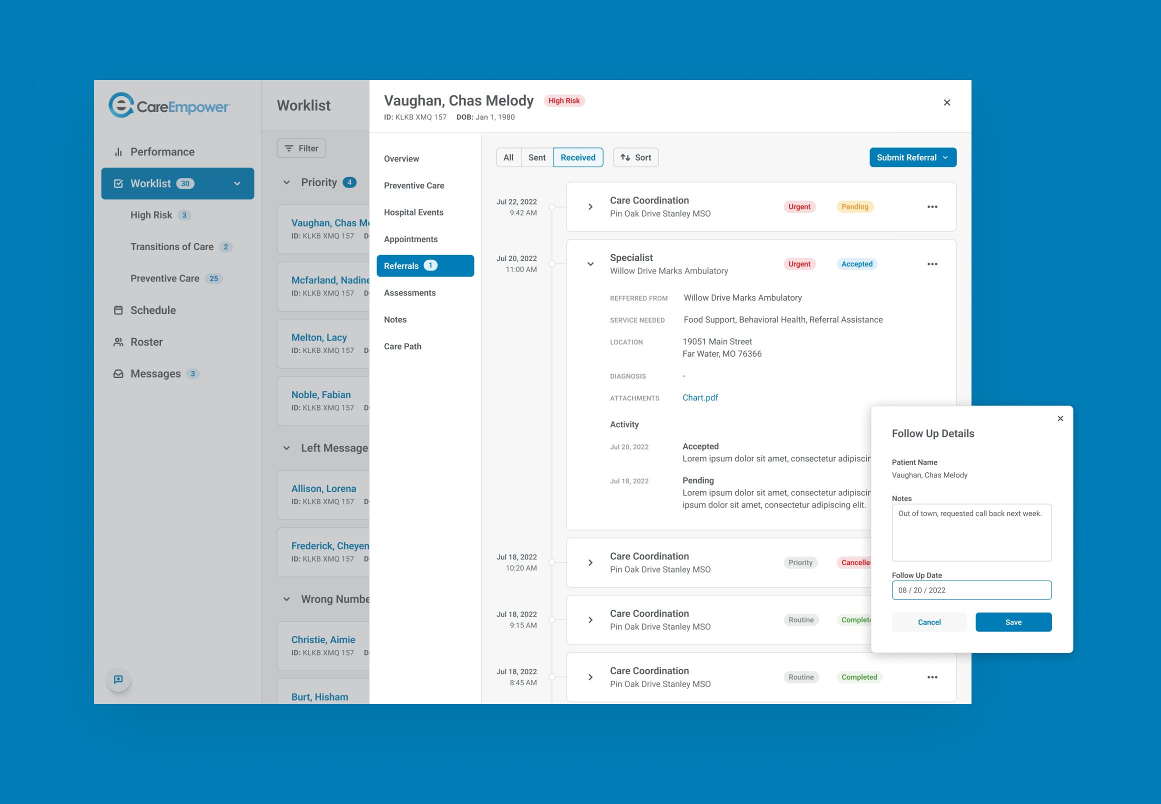
We reorganized patient information and presented it in a more streamlined and useful way, putting the focus on the information that mattered the most to complete the task at hand. We improved the overall UX by rewriting the messaging in the interface, clearly explaining what was happening and why. We removed any unnecessary steps (or combined them with other steps) from workflows whenever possible to increase efficiency.
Going through multiple iterations allowed us to eliminate the elements that didn’t work, build on the pieces that did work, and find new tweaks within our proposed solutions. At the end of the day, we were able to wrap all of the core features into a package that made better sense to users and improved their patient pipeline management.
An Optimized User Experience for Better Health Outcomes
Going from a relatively static database to something more proactive and intelligent promises to take CareEmpower up The Ladder from merely Functional to Delightful, and possibly even Meaningful. By streamlining and automating processes, we’re transforming manual workarounds and helping front office staff more efficiently see which patients are coming in at what time and for what reason. This makes healthcare providers better able to provide the care their patients need.
The biggest compliment we can get for our work is when the changes we make to a user flow actually impact an organization’s real-world processes. Our designs and reworking of the user flow for CareEmpower helped the HealthBI team more clearly see their inefficiencies. One of the key pieces of this was simply the fact that the end users - front office staff - are often not fluent in medical terminology. By looking through the eyes of these users we could more clearly highlight how the user interface could make the entire process more intuitive and easier to manage.
