Infusionsoft
Taking the Pain Out of Payment Updates
As an Infusionsoft customer and avid supporter, Drawbackwards identified a set of issues with a basic process that users were trying to complete every day: updating their billing information. The process was not only frustrating for customers, but also causing the company to lose money by chasing customers down by phone for their credit card information. By providing a workflow audit and designing a new experience, our team proposed a solution that had the potential to boost customer satisfaction, decrease churn and ultimately save Infusionsoft over $100,000 annually.
A Process that was Prohibiting Success
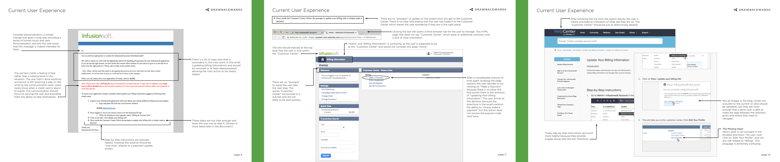
The old process for updating credit card information was creating problems for their customers. The interface didn't match the email instructions that had been sent to the customer, leaving the customer without a clear path to pay with updated billing information. Because of these gaps, users often spent hours troubleshooting, calling for support, trying to find a solution or simply letting their card expire. Meanwhile, Infusionsoft was facing increasing operational costs and confusing customers.
Simple Solutions for a Complex Process Problem
To give Infusionsoft a complete picture of the problem, Drawbackwards provided a redlined, screen-by-screen audit to show the steps of the process, where there were weaknesses and the effects of those gaps. We then used a design thinking process to create a new solution with a combination of subtle and overt changes that dramatically improve the experience by eliminating each friction points in navigation and data entry.
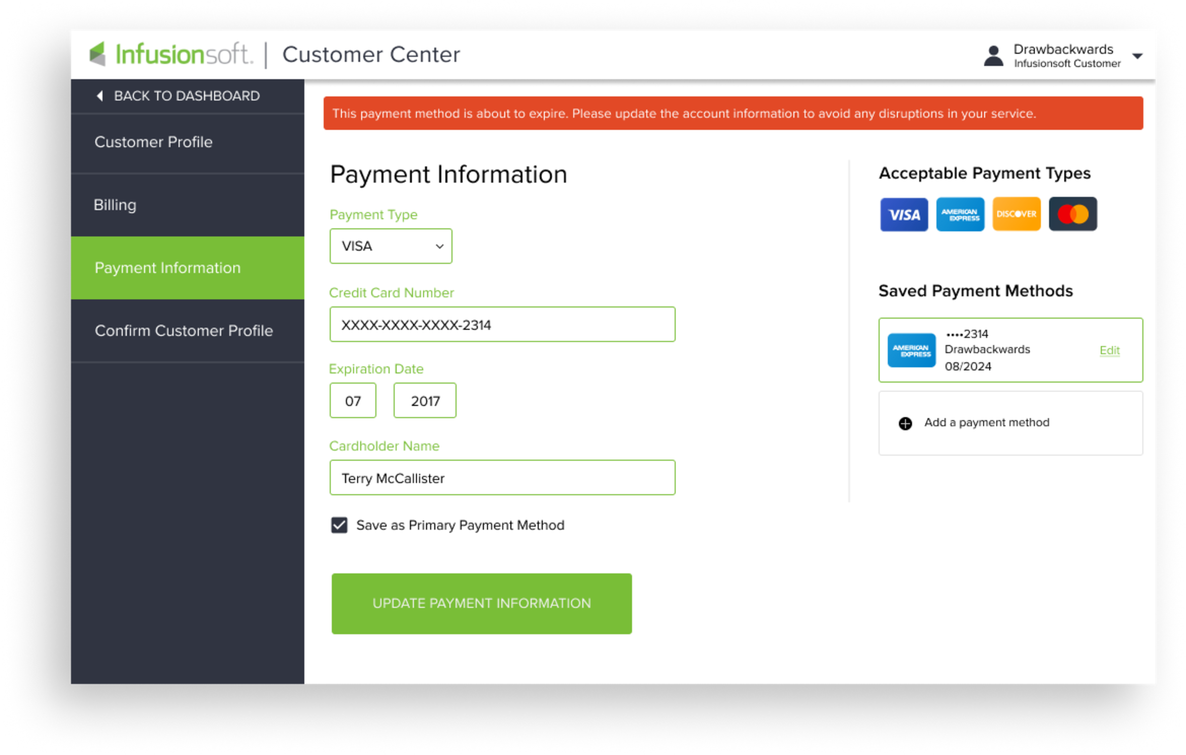
For example, customers previously received a lengthy, complicated email notification when their credit card on file is about to expire. But with our recommended experience, the email gets the same message across much faster, keeping the user focused on the primary action they need to take: updating their payment information.
Once the customer signs in (which also takes less time, thanks to auto-populating their email address from the email link), they are taken directly to the Payment Information screen. On this redesigned screen, they can quickly orient where they are, easily update their credit card, and be on their way. They leave the experience satisfied, and Infusionsoft has what they need.

Small Changes, Huge Savings
These UX design recommendations show how simplifying an everyday process with small changes can make a huge difference. By applying changes derived from our audit insights and design thinking, the company stands to save hundreds of thousands of dollars. Because less friction in the customer experience means more success, and greater satisfaction, for both the customer and Infusionsoft.