Quarantining Complexity with Strategic UX Design and Development

“Simple can be harder than complex.” – Steve Jobs
The best products are simple to use and makes our lives better. What we often don’t realize is how much strategic thinking, UX design, development work it takes to get there. In fact, one of the most valuable – yet hardest to achieve – traits of a software tool is its ability to quarantine complexity, or shift the responsibility of making decisions from the user to the code.
For example, take notifications. Almost every tool uses notifications of some sort to inform users and drive action. They may seem like a no-brainer (“Just send an email! Add a push notification!”), but with multiple devices, user types, flows, formats, and endless other considerations, this “basic” feature gets complicated quickly.
Slack realized the complexity of their notifications and designed a smart system to manage them. It’s seems super simple to the user. They just get the right notifications, in the right place, at the right time. It’s anything but simple behind the scenes. Just look at all the considerations that go into whether they notify a user about a message!
Source: https://slack.engineering/reducing-slacks-memory-footprint-4480fec7e8eb
This attention to detail and ability to quarantine complexity have contributed to Slack setting a record for the fastest-ever startup to achieve a $1 billion valuation. They’ve also gained millions of active, loyal users and raised hundreds of millions in funding.
Quarantining complexity is like a superpower. It requires experienced designers and developers with a proven track record and a strategic process that balances small details with big-picture thinking. Here are just a few of the design methods and development strategies that companies like Slack and our team at Drawbackwards use to do it.
UX Design Methods for Quarantining Complexity
Journey mapping
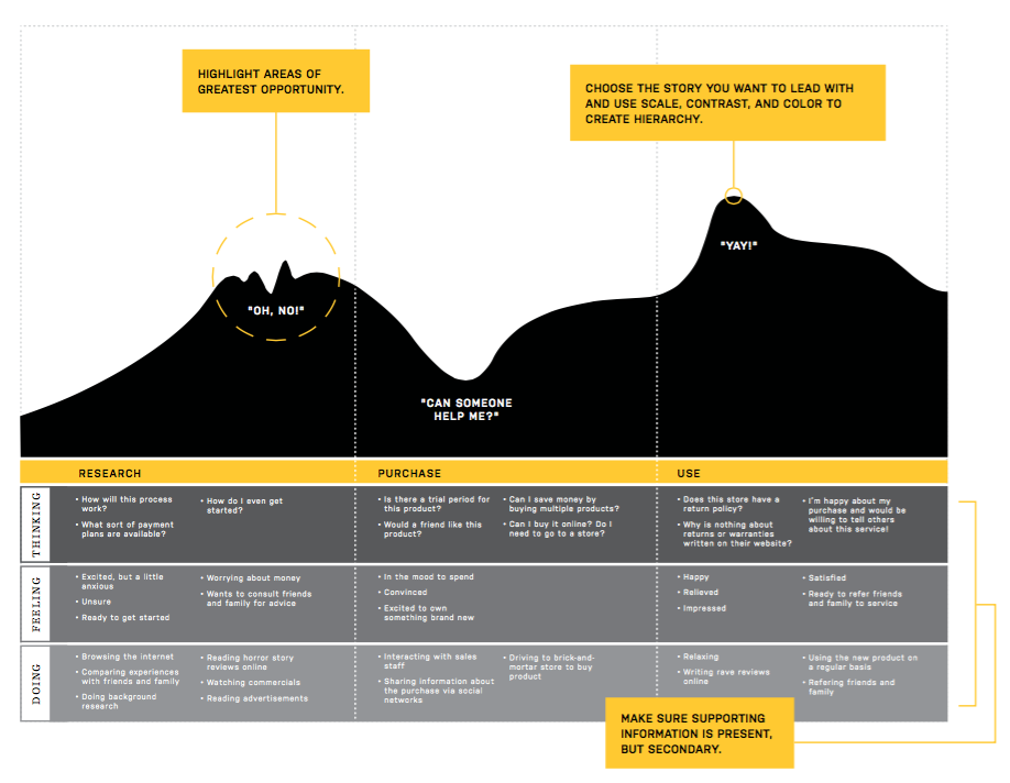
Journey mapping involves mapping out each step of the customer journey to see a visual representation of how people interact with and feel about your brand over time and across channels. It also helps build consensus and alignment among your team because it gets stakeholders involved, uncovers insights that may not come out in everyday conversations, and has people more invested in the project’s success. Together, you can gain a better understanding of how your customers experience your product today, as well as how to improve it in the future.
A Sample Customer Journey Map. Source: MappingExperiences.com
Learn more about journey mapping in this post.
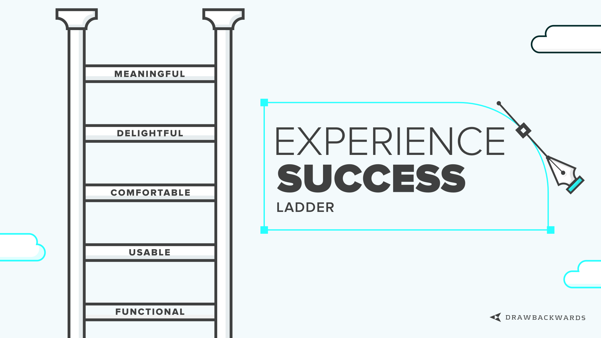
Experience Success Ladder
The Experience Success Ladder serves as a benchmark for assessing the value your product or service provides now, as well as goals to aspire to in the future. Each rung represents a higher state of emotional satisfaction and meaningful value. By moving up from one rung to the next, you’re not only better meeting your users’ needs, but also increasing your company’s likelihood of success.
Learn more about the Experience Success Ladder in this post.
Quantitative and qualitative user research
In the past, you could use either quantitative or qualitative data to distill insights and develop smart products. But today, UX design and software product thinking aren’t so black and white. The best products don’t just rely on data OR feelings — they use both.
Some of the methods we’ve found most effective for gathering information to quarantine complexity include:
Analytics software
Software like website trackers, heat maps, and other analytics tools collect data behind the scenes to show user behavior while they’re using a product. They’re an easy way to gather data from lots of people without requiring extensive time and resources, and they track what users are actually doing, not what they say they would do.
Field studies
During a field study, your team goes out “into the field” to immerse themselves in a typical day in the life of your user. It’s the best way to observe how they actually use products in their natural environment, what external forces affect their decisions and actions, and their real behaviors. In fact, UX veteran Jared Spool describes field studies as “the fastest path to great UX” and explains that you can reap the benefits in as little as two hours every six weeks. We wholeheartedly agree.
Usability testing
Usability testing is all about testing your product with real users to see if it works as you intended. It’s most commonly done after a product is built, but the best results come from testing before, during, and after development. (Take a look at this article for tons of practical tips on conducting usability testing.)
User interviews
User interviews can be done as part of a field study, usability test, or independently. They involve having one-on-one conversations with users to learn more about them, how and why they use a product, what’s working well, what could be improved, and more. Many of the usability testing best practices and principles in the post above also apply to user interviews. This article has some handy tips too.
UX Rings
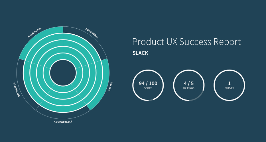
There are plenty of techniques for tracking qualitative information (user interviews, personas, journey mapping, etc.), and plenty of tools for tracking quantitative information (analytics, conversion rate, usage duration, etc.). But there isn’t one that does both.
That’s why we created UX Rings.
UX Rings takes the Experience Success Ladder a step further. It provides a multidimensional ranking that combines quantitative and qualitative data to assess your product’s or service’s performance within each segment. As your product improves to a certain level in each segment, you complete a ring. The goal is to finish all 5 rings — the epitome of successful design – with mastery of each segment of the user experience.
Development Strategies for Quarantining Complexity
Set defaults for common cases, then allow configuration for edge cases
Using the methods above, the most common user types, paths, and preferences will emerge. Then, develop your product in a way that makes sense for the common cases, while giving users easy configuration options so they can customize their experience if they have different preferences.
Tip: It’s tempting to show people all the different options and features they have access to, but doing that can overwhelm them and make the interface unusable. Make sure to prioritize only the most important configuration options based on your user and business goals. Then, design and develop them in a way that doesn’t bloat the system or hinder the experience.
Reveal functionality based on the user’s experience level and tech savviness
Along the same lines as setting defaults and configurations, many products make the mistake of showing users everything they can do with the tool on day one. However, this can be overwhelming and cause frustration and abandonment.
Instead, design and develop the product so it primarily promotes the functionality that your most common types of users need to complete their most important tasks. Then, nudge them into a more personalized, advanced experience as they become more familiar with it. For example, consider offering a tour for new users, and set basic notifications based on your user research and UX best practices. Over time, you can introduce new features, more advanced capabilities, and configuration options for power users.
Use data and technology to auto-fill form fields
Forms are a weak spot of digital products and services because they often ask users for a lot of unnecessary information, causing frustration and confusion. To improve the experience, use the data you’ve gathered from your analytic tools and research, machine learning, artificial intelligence, collaborative filtering, and other methods to auto-fill certain fields.
A basic example is when you ask users for their address when making a purchase. Instead of requiring them to enter their full address, you could use autocomplete to suggest the full address as the user is typing, or pre-fill the city and state when the user enters their zip code. Or, if a form field has lots of different options in a drop-down menu, surface the most common selections to the top of the list so users don’t have to scroll to find the one they’re looking for.
Quarantine Complexity to Deliver Simplicity
Many people say they want to create software that eliminates the complexity of a task. While it’s rarely possible to remove it completely, the best designers and developers can quarantine it. By making the task easier and more enjoyable to complete, you’re not only helping your users, but also providing the type of experience that directly improves business metrics today, while making room for innovation in the future.
For more details on this approach and how it could help your company design better experiences, get in touch with our team.


